Video PC Sizes Templates
Perfectly sized videos, every time! Customize Pippit’s video templates for PC-friendly dimensions—ensuring crisp visuals and seamless playback for your audience in just moments.
80 results found for "Video PC Sizes Templates"
Videos
Images
Digital In-video
Digital In-video
Black Red, PC Review #yt_templates #productreview
pc
pc
#protemplatetrends #pc #pcdisplay #marketing
pc
pc
#protemplatetrends #pc #pcdisplay
Cityview Interface
Cityview Interface
#travel#city#view#interface
Album chill
Album chill
#vlog #chill #huutuyen77 #xh #maupro
Vlog chill
Vlog chill
#huutuyen77 #vlog #chill #topcreator #xh
Step into style 3
Step into style 3
#fashion #style
PC Review Intro
PC Review Intro
Gaming PC, Digital #productreview #yt_templates
Pc
Pc
#pc #pcdisplay #computer
pc
pc
#protemplatetrends #pc #pcdisplay
Cityview Interface
Cityview Interface
#travel#city#view#interface
Summer!
Summer!
#zepteo
chiều Biên giới
chiều Biên giới
#nhacbolero#mauphongcanhdep
Ghép hiệu ứng 159
Ghép hiệu ứng 159
#ghepdienthoai#hieuungdep#nhachay#quangngan68
pc
pc
#protemplatetrends #pc #pcdisplay #marketing
pc
pc
#protemplatetrends #pc #pcdisplay #marketing
3D Computer
3D Computer
#macbookframe#estetik3d##hq#fyp
COFFEE | DRINKS 🍹
COFFEE | DRINKS 🍹
#coffee #coffeetime #trend #drinks #vlog
NEW — COFFEE ☕️-
NEW — COFFEE ☕️-
#trend #coffee #coffeetime #slowmotions #کافه
Pole dance
Pole dance
#poledance#poledancer#sports#marketing
Shalawat Rasul
Shalawat Rasul
#protrend#shalawatviral#fypforryou#capcutfyptemplate
pc display
pc display
#MKT #pc #pcdisplay
pc
pc
#protemplatetrends #pc #pcdisplay #marketing
1 or up to 11 pc/clp
1 or up to 11 pc/clp
11 clip templates #datenight #miniclip #transition
cinematic
cinematic
#cinematic#videography#foryou#cinematicvibes#vlogs
COFFEE TEMPLATE 🍰
COFFEE TEMPLATE 🍰
#coffee #trend #coffeetime #coffeelover #fyp
NGAN 222
NGAN 222
#capcutt9#ghephieuungdep#ghepdienthoai#quangngan68
pc
pc
#protemplatetrends #pc #pcdisplay #marketing
pc
pc
#protemplatetrends #pc #pcdisplay #marketing
Soccer Theme Sports Industry Templates Promotion
Soccer Theme Sports Industry Templates Promotion
Business Template, Sports Industry, soccer theme open, demand templates. Easily create advertising videos with our customised templates! (You can change the color on the editing page.On the APP: Adjust>Saturation>Color. On PC: Adjustment>Basic>Adjust>Color.)
Montagem fuego
Montagem fuego
#fyp#carsedit#uspro#capcuttemplate#prostic
CINEMATIC PRODUK
CINEMATIC PRODUK
pakai aja jangaj lupa follow
< 4CLIP - NEW STYLE🎩
< 4CLIP - NEW STYLE🎩
#trend #fyp #4clip #newtemplate😍 #london
Photography
Photography
use photos with greenery. #photography#photo
Pc
Pc
#MKT #pc #pcdisplay
pc
pc
#protemplatetrends #pc #pcdisplay
HOME || TREND EDIT 🔝
HOME || TREND EDIT 🔝
#home #homevlog #trend #coffee #trendedit
Room Tour Cinematic
Room Tour Cinematic
#housetour #fyp #protemplatetrends #hometour
tinting car
tinting car
#protemplatetrends #car #tingting #tingting
tinting car
tinting car
#protemplatetrends #car #tingting

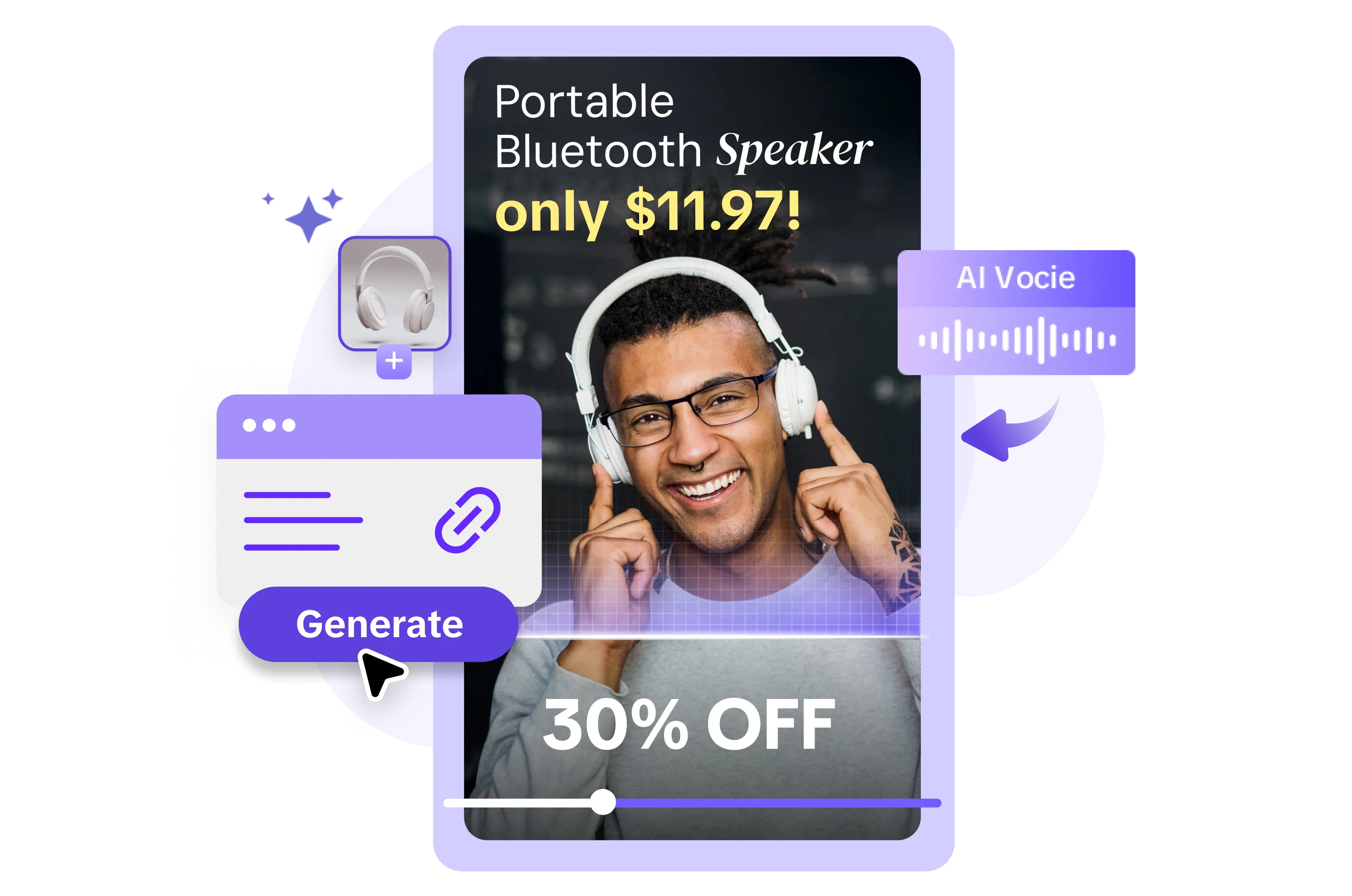
All the Smart Tools You Need to Streamline Your Content Creation
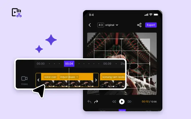
Video Editor
A powerful all-in-one video editing tool packed with features.
Sales Poster
Effortlessly create AI-powered promotional posters for your products.
Smart Crop
Crop videos to perfectly fit any platform's aspect ratio.
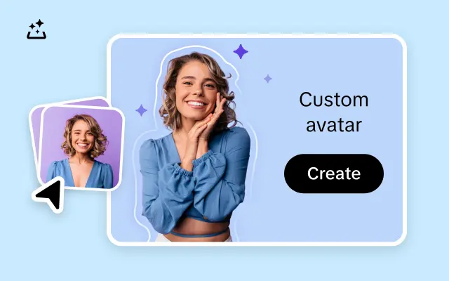
Custom Avatar
Create your own unique digital avatar for a personalized touch.
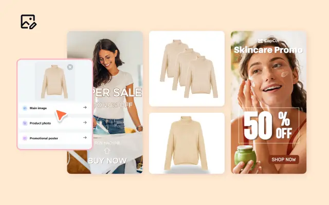
Image Editor
Your go-to tool for creating and editing images with ease.
Quick Cut
Speed up video editing by transcribing and editing directly from text.
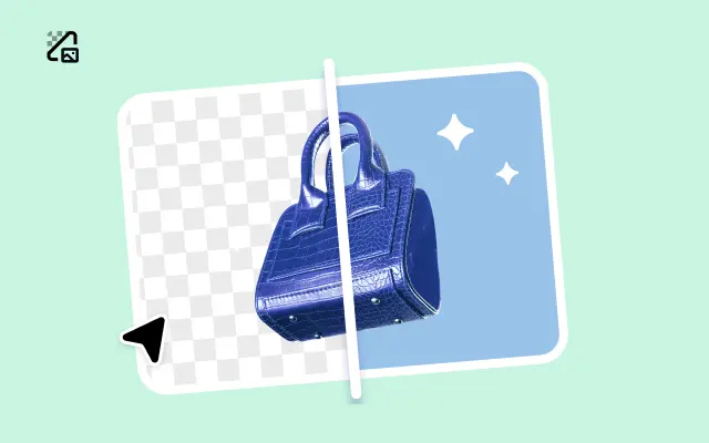
Remove Background
Instantly remove backgrounds from images with one click.
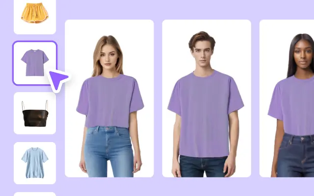
AI Model
Showcase your clothing on AI models for an immersive try-on experience.
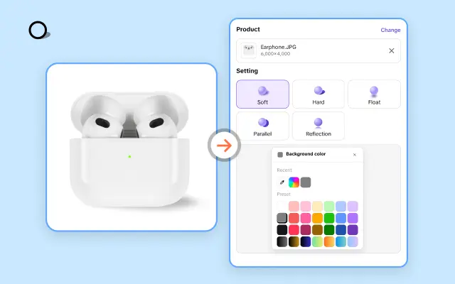
AI Shadows
Add lifelike shadows and lighting to products for enhanced realism.
About Video PC Sizes Templates
Creating video content that resonates with your audience has never been more essential. But tackling the technicalities of size specifications for various platforms? That can quickly become overwhelming. Enter Pippit’s Video PC Sizes Templates – the perfect solution for creators and businesses looking to streamline their video production workflow while ensuring every visual hits the mark.
Pippit’s Video PC Sizes Templates are expertly designed to take the guesswork out of formatting for different platforms and devices. Whether you’re crafting a widescreen explainer video, a vertical ad for mobile, or a square social media post, we’ve got you covered. With predefined templates tailored for almost every screen size and orientation, you can focus on what matters most – creating impactful, engaging video content. No more resizing hassles or worrying about compatibility – just a seamless path to professional-grade results.
But it’s not just about convenience – it’s about achieving results. With these templates, your videos will look polished no matter where they’re displayed. Our customizable designs provide the flexibility to incorporate your brand’s style while adhering to industry standards. Need to tweak dimensions for a specific platform? Pippit’s intuitive editing tools make adjustments effortless – drag, drop, resize, and go! Quickly align your visuals with your vision without sacrificing quality or aesthetic appeal.
Ready to elevate your video production game? Explore Pippit’s Video PC Sizes Templates today and discover how to save time, cut through complexity, and create screen-ready content that dazzles. Sign up now, and let Pippit take the stress out of video editing while you stay focused on driving engagement and growing your brand.


