Mobile In Templates
Create mobile-friendly designs that shine anywhere! Pippit’s customizable templates adapt seamlessly to devices—ensuring your content looks amazing and engages audiences wherever they scroll.
80 results found for "Mobile In Templates"
Videos
Images
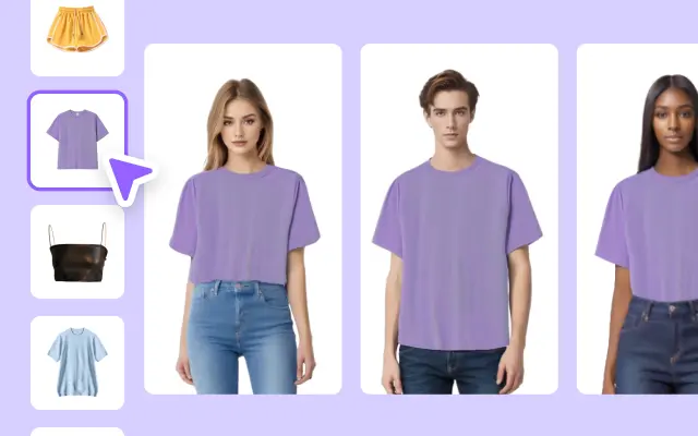
Mobile Phone Using Display
Mobile Phone Using Display
Technology, Mobile Phone, Product Display. Want to make ad videos that get results? Try our template today!
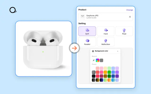
Creative Advertising For Mobile Phone Accessories
Creative Advertising For Mobile Phone Accessories
Creative Advertising For Mobile Phone Accessories, electronic products, Earphone, Product Display. Transform your ad game with our video template!
Mobile and Computer Display
Mobile and Computer Display
Electronic, Creative, Purple, Minimalist.
Impress your audience with stunning ad videos.
Electronic Devices Promotion
Electronic Devices Promotion
Mobile Phone, Computer, Contrast Colored Style. Boost your ad campaign with our easy-to-use video template.
Laptop Using Display
Laptop Using Display
Mobile Phones, Pocket Computers Realistic Style, Big Sale. Create engaging ads quickly and easily.
Intro Logo Templates for High-tech Company Promotional Videos
Intro Logo Templates for High-tech Company Promotional Videos
PNG Images, Intro, Logo Templates, High-tech, Company Promotional. Boost your ad campaign with our easy-to-use video template.
Entertainment Industry Neon Style Nightclub Event Promotion Business Templates
Entertainment Industry Neon Style Nightclub Event Promotion Business Templates
Entertainment industry, neon style, nightclub event promotion, cyberpunk, make a statement with your commercial video.
Minimalist Mobile Phone New Arrival
Minimalist Mobile Phone New Arrival
Minimalist, Modern, Simple. Animation, Text, Motion Graphics. Improve your ad video quality today.
Phone Case Product Display Text To Speech TikTok Style
Phone Case Product Display Text To Speech TikTok Style
Phone, multi gallery, accessories, Promotion, mobile phone
Electronic Devices Display
Electronic Devices Display
Mobile Phone, Computer, Tech Style. Make your ads more engaging with our video template.
Multi-Person Presentation of Digital Products
Multi-Person Presentation of Digital Products
Mobile Phone, Computer, Minimalist Style. Make an impact with your ads using our easy-to-use video template.
Sunglasses sales promotion in social media
Sunglasses sales promotion in social media
Mobile interface design
Business Template, Sports Industry, soccer theme open-demand templates.
Business Template, Sports Industry, soccer theme open-demand templates.
Business Template, Sports Industry, soccer theme open-demand templates. Make your ads more engaging with our video template.
Hiệu Ứng Đẹp 1 Ảnh
Hiệu Ứng Đẹp 1 Ảnh
#freepro
Mobile Phone Multifunctional Display
Mobile Phone Multifunctional Display
Tech Style, Digital Appliance, Product Display. Make better ads with our template now!
Mobile Phone & Computer Daily Sale
Mobile Phone & Computer Daily Sale
Vaporwave Style, Pink, Desktop Computers, Laptops, Tablets, PDAs, Mobile Phones, Product Display.Create engaging ads quickly and easily.
keren banget lho
keren banget lho
6.8 #transisi#fyp#merdekanl#bocil
Dating APP Promotion in Tiktok Style
Dating APP Promotion in Tiktok Style
Dating, App, Couple, Smartphone, Promotion, Woman, Man. Make Your Ads More Engaging with Our Video Templates. #dating #app #couple #promotion #trendcapcut
Digital Accessories Daily Promo-Tiktok Style
Digital Accessories Daily Promo-Tiktok Style
Tiktok Style, Data Cables, Hubs, Mobile Hard Drives, Sales, Product Showcase. Boost Your Video Ads With Our Templates.
Sports Industry - Minimalist Aesthetic Outdoor Sports Templates
Sports Industry - Minimalist Aesthetic Outdoor Sports Templates
Website UI For Sport Industry Motivation
Modern Mobile Phone Sale
Modern Mobile Phone Sale
Green, Black,Modern, Simple, Mobile Phone & Computer. Summer Sale. Street Style. Create stunning ad videos with ease
Memphis Mobile phone Display
Memphis Mobile phone Display
Memphis Style, Using Display, Product Display. Create stunning ad videos with ease.
NGAN 222
NGAN 222
#capcutt9#ghephieuungdep#ghepdienthoai#quangngan68
Digital Devices Display
Digital Devices Display
Contrast Colored Style, Mobile Phone, Computer. Elevate your ads with our professional-grade video template.
Digital Accessories Using Display Street Style
Digital Accessories Using Display Street Style
Street Style, Data Cables, Hubs, Mobile Hard Drives, USB Drives. Save time andmonev on ad video creation.
Summer Music Festivals Social Media Rock Style Business Templates
Summer Music Festivals Social Media Rock Style Business Templates
Summer music festivals, social media, rock style, make a statement with your advertising video.
Multi-person Using A Mobile Phone
Multi-person Using A Mobile Phone
Contrast Color Style, Blue, Digital Industry, Product display.Simplify your ad video creation process.
Digital Products Mobile Showcase Light Tone Electronics
Digital Products Mobile Showcase Light Tone Electronics
Digital products, cell phone displays, light tones, high end, tech, use our templates to create unparalleled advertising videos.
Memphis style for mobile phone using display.
Memphis style for mobile phone using display.
Impress your audience with stunning ad videos.
Electronic Products
Electronic Products
Minimalist Style, Mobile Phone, Computer. Make better ads with our template now!
Laptop Promotion Ad Template
Laptop Promotion Ad Template
Mobile Phones, Pocket Computers, Electronic product, Realistic Style. Save time and money on ad video creation.
Viral rap text
Viral rap text
#proeffects
intro Creative Logo Minimalist Style Business Templates
intro Creative Logo Minimalist Style Business Templates
Creative logo, minimalist style, instantly improve the quality of your advertising video.
Mobile Phone Promotion
Mobile Phone Promotion
Stylish, Cool, Blue, Black, Electronic product. Get noticed with high-quality ad videos.
New Mobile Phone Display
New Mobile Phone Display
Minimal Style, Multi-Person Display, White. Make your ads stand out with our template.
Minimalist Modern Animation Sale
Minimalist Modern Animation Sale
Modern, Black, White, Simple, Fashion, Minimalist. Mobile Phone & Computer Using. Make a statement with your ad videos.
Electronic Products Usual Promotion
Electronic Products Usual Promotion
Contrast Colored Style, Mobile Phone, Computer. Create eye-catching ad videos with our customizable template.
gbh
gbh
ggg
Digital Appliances, Small Appliances, Minimalist, Business Templates.
Digital Appliances, Small Appliances, Minimalist, Business Templates.
Digital Appliances, Small Appliances, Minimalist, Business Templates. Make your ads more engaging with our video template.
CTA Clothing Industry Ads Template in Magazine Style
CTA Clothing Industry Ads Template in Magazine Style
Clothing Industry, Fashion, Apparel, CTA, Ads Templates, Magazine Style. Make Better Your Ads with Our Templates!

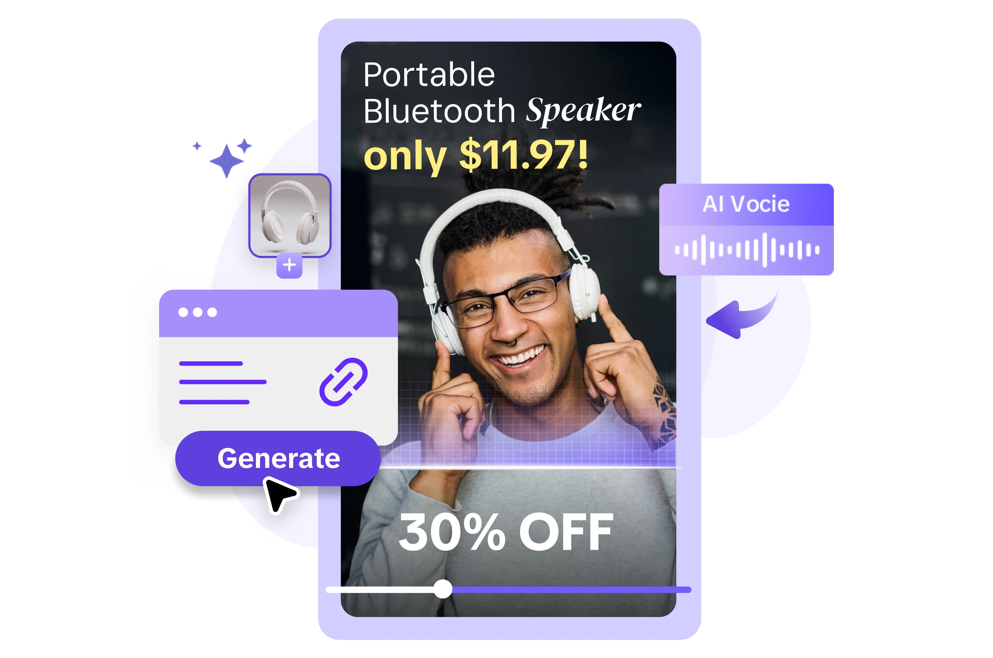
All the Smart Tools You Need to Streamline Your Content Creation
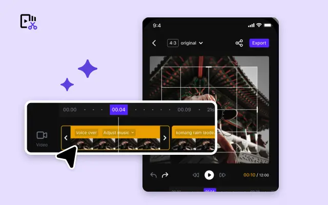
Video Editor
A powerful all-in-one video editing tool packed with features.
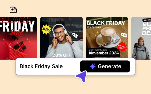
Sales Poster
Effortlessly create AI-powered promotional posters for your products.
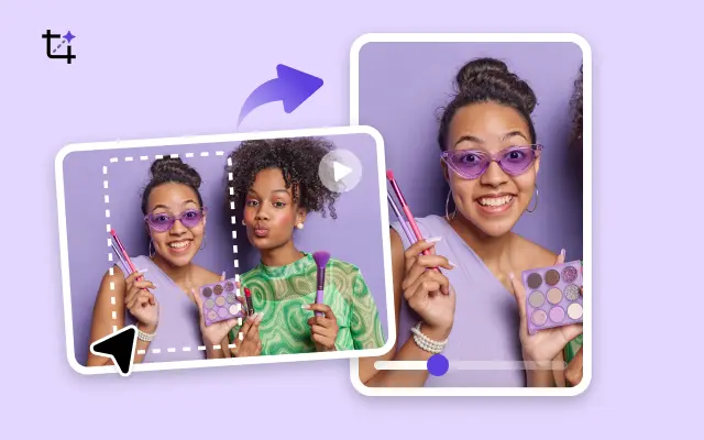
Smart Crop
Crop videos to perfectly fit any platform's aspect ratio.
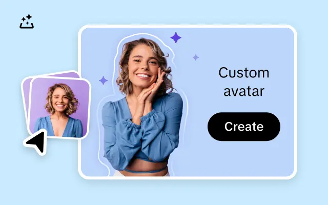
Custom Avatar
Create your own unique digital avatar for a personalized touch.
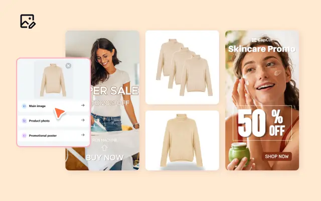
Image Editor
Your go-to tool for creating and editing images with ease.
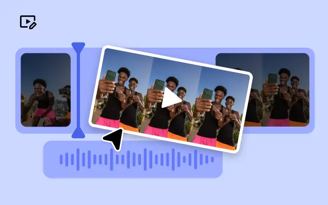
Quick Cut
Speed up video editing by transcribing and editing directly from text.
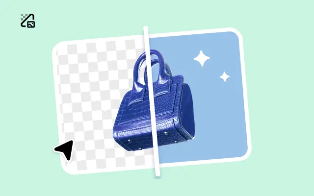
Remove Background
Instantly remove backgrounds from images with one click.
AI Model
Showcase your clothing on AI models for an immersive try-on experience.
AI Shadows
Add lifelike shadows and lighting to products for enhanced realism.
About Mobile In Templates
Have you ever struggled to create professional, eye-catching content for mobile audiences? Whether you're designing for smartphones or tablets, mobile-friendly templates can be a game changer for your business. That's where Pippit comes in—a dynamic e-commerce video editing platform offering mobile-in templates designed to captivate, engage, and boost conversions.
Pippit’s mobile-in templates are expertly crafted to ensure your content looks flawless on smaller screens. Gone are the days of clunky layouts and compromised designs. With Pippit, you gain access to sleek, customizable templates that adapt seamlessly to mobile devices. Whether you're editing product videos, showcasing behind-the-scenes content, or creating dynamic advertisements, these templates will deliver high-impact visuals that are tailored to the modern mobile audience.
Imagine effortlessly creating polished multimedia content that fits perfectly into the palms of your viewers' hands. With Pippit’s intuitive design tools, it’s easier than ever to customize fonts, colors, and video elements to match your brand identity. Plus, all mobile-in templates are optimized for fast loading speeds, ensuring your audience stays engaged without interruptions. No more losing potential customers to slow or unresponsive content—Pippit empowers you to wow your audience instantly.
Ready to start? Sign up for Pippit today and explore our library of mobile-in templates. Bring your creative vision to life in just a few clicks—the platform is built with user-first technology, so even beginners can achieve professional-grade results. Let Pippit simplify your multimedia content creation process and elevate your brand for mobile success.


