Template Width
Adjust template width to suit your vision. With Pippit, seamlessly resize layouts for any screen or style—ensuring your content always looks flawless and professional.
80 results found for "Template Width"
Videos
Images
versi no lyrics
versi no lyrics
#smoothslowmo#slowmosmooth
Cinematic Trend
Cinematic Trend
#hazhel#gayainovasi#fyp#trend
Sinematik simpel
Sinematik simpel
#olahraga #bola #basket
transition full
transition full
#transition #cinematic #fyp#viral#trend#trending
Peaceful Earth
Peaceful Earth
#vlog #minivlog #trendtemplate #landscape #nature
CAR EDITS
CAR EDITS
#caredit#caredits#us#carcinematic
Shake it to the max
Shake it to the max
#anime#cinematic#ziidb76
16:9 NO MIRROR ASIKK
16:9 NO MIRROR ASIKK
tor monitor ketua#fyp#jjtipis#trend#zfx117
Epic Transition
Epic Transition
#trendtemplate#capcutsealeague#transition#cinematic#fyp
TRAILER EPIC
TRAILER EPIC
#trailer #trailerfilm #cinematic #trend
CINEMATIC VIDEO
CINEMATIC VIDEO
#fyp#cinematic#nature#trending#viral
Mejikuhibiniu 🍃
Mejikuhibiniu 🍃
5 Klip versi miring #aeestemplate
Modern Gradient & Tech Style Corporate Industry Business Meeting Template
Modern Gradient & Tech Style Corporate Industry Business Meeting Template
Boost Your Promotion, Blue Pink Color , 3 Clips
Create Amazing Ads With Our Template
Company Logo Intro Display Template
Company Logo Intro Display Template
Logo Templates,PNG lmages, Intro, Company Promotional. Use Our Customized Templates To Easily Create Advertising Videos!
CINEMATIC
CINEMATIC
#cinematic#minivlog#aestetic#fyp#viral
TimelessCinematic
TimelessCinematic
#protrend#timeless#foryou
Epic Transition 113
Epic Transition 113
#trendtemplate#capcutsealeague#transition#cinematic#fyp
11 foto landscape
11 foto landscape
#11foto#fototransisi#capcut#foryou
Gym Cinematic
Gym Cinematic
#gym#sport#boxing#usa#cinematic
Fashion Cinematic
Fashion Cinematic
#protemplateid#mytemplatepro#capcutsealeague#fashion
cinematic car trend
cinematic car trend
#cinematic#car#protemplateid#fyp
fall in love
fall in love
#fallinlove#aesthetic#cinematic#fyp#travel
Daily Weekend
Daily Weekend
#fyp#trend#weekend
Epic Transition
Epic Transition
#trendtemplate#capcutsealeague#transition#cinematic#fyp
Landscape 3
Landscape 3
#vlog #minivlog #landscape #landscapevideo#nature
short escape
short escape
#shortescape#dailyvlog #dailystory#dailylife #fyp
Gradient Style Enterprise Recruitment Promotion Template
Gradient Style Enterprise Recruitment Promotion Template
Gradient style and cool corporate recruitment promotion template, providing suggestions for your advertising production
New Car Cinematic
New Car Cinematic
#fyp #cinematic #protrend #highquality #car
4 foto landscape
4 foto landscape
#4foto#foto#landscape#transisi#viral
I'm feeling good
I'm feeling good
#vlog#cinematic#minivlog#trending#fyp
Car Cinematic
Car Cinematic
#cinematic #protrend #mytemplatepro #protemplatetrends
DAILY CINEMA
DAILY CINEMA
#dailyvlog#vlog#cinematic#aesthetic
LA MÚSICA
LA MÚSICA
#trending#cinematic#car #fyp #phonkremix #viral
Cinematic Vlog
Cinematic Vlog
#cinematic #vlog #trendingtemplate #recap #fyp
Landscape template
Landscape template
#velocity#foryou#trending#newtemplates#fyp
Montagem Cona
Montagem Cona
#cinematic#slowmo#makeitviral#cinematichd#trend
Running
Running
#trendtemplate#CapCutSEALeague#cinematic#travel #vlog
House Vlog
House Vlog
#imobiliaria #realestate #house #vlog #tour
CARS EDIT
CARS EDIT
#fyp#cinematic#carsedit
Facebook Ads Summer Sales Business Template Minimalist Style
Facebook Ads Summer Sales Business Template Minimalist Style
Summer, Sales promotion. Make your ads stand out with our template.

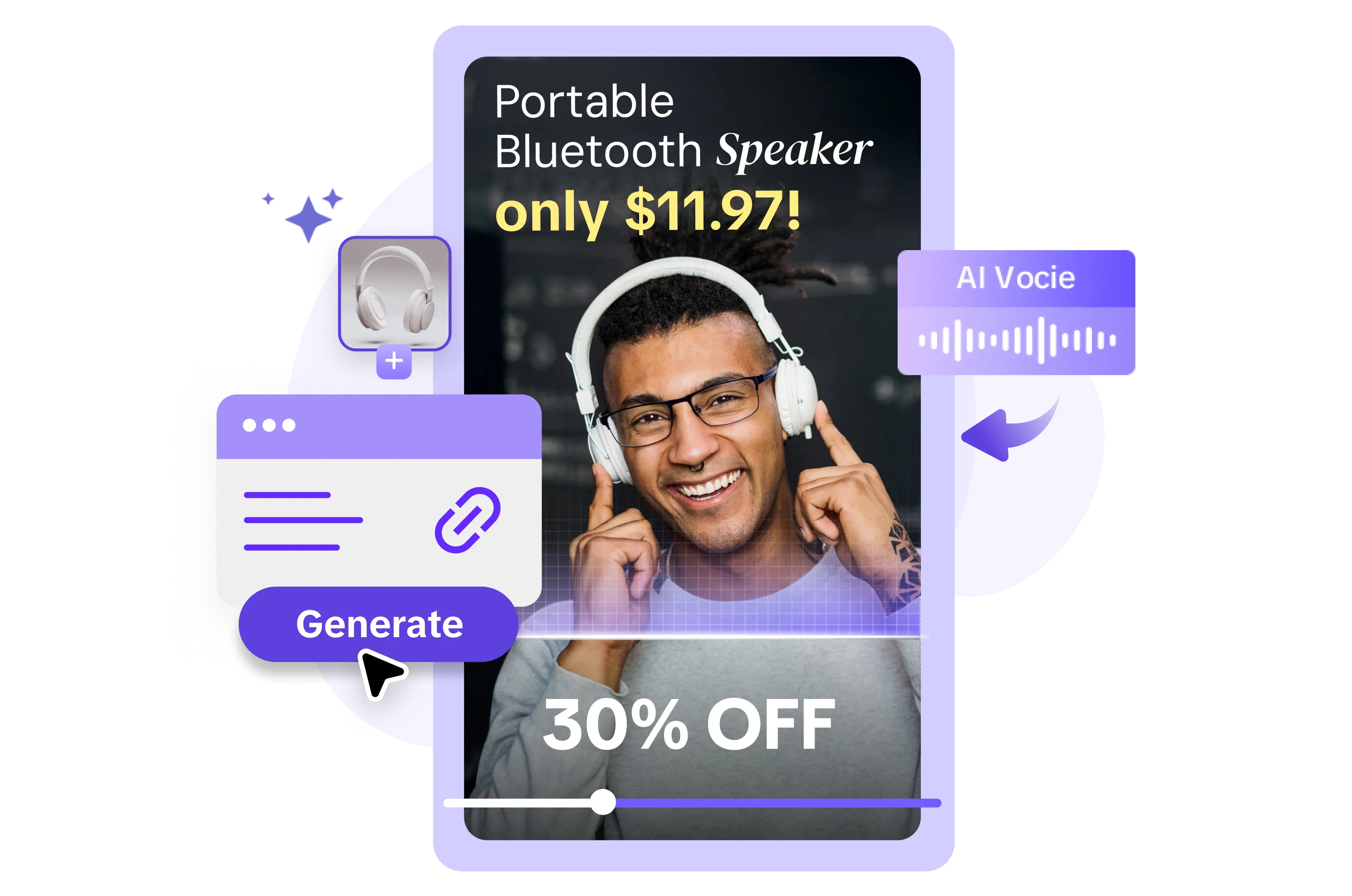
All the Smart Tools You Need to Streamline Your Content Creation
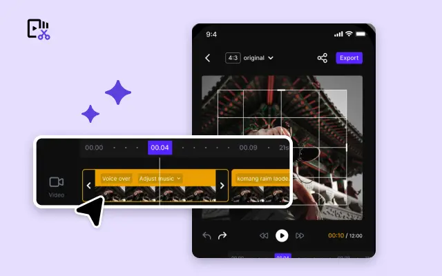
Video Editor
A powerful all-in-one video editing tool packed with features.
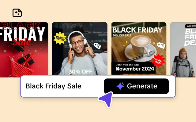
Sales Poster
Effortlessly create AI-powered promotional posters for your products.
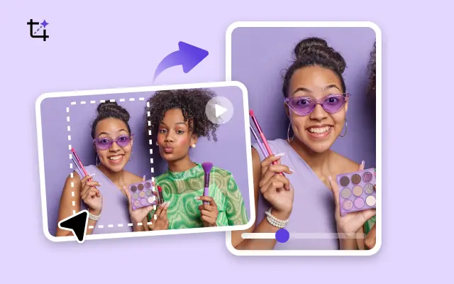
Smart Crop
Crop videos to perfectly fit any platform's aspect ratio.
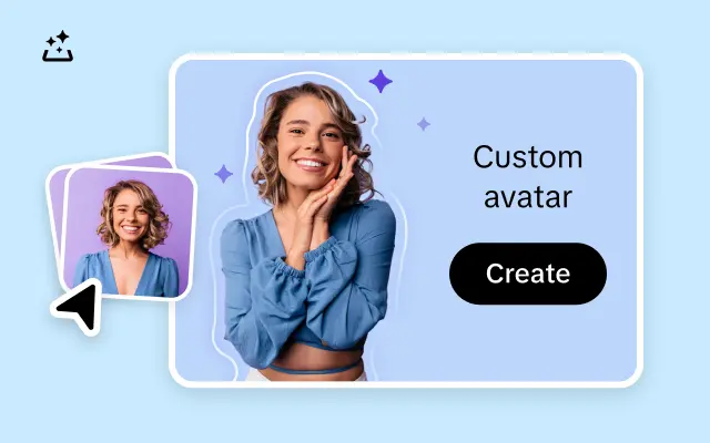
Custom Avatar
Create your own unique digital avatar for a personalized touch.
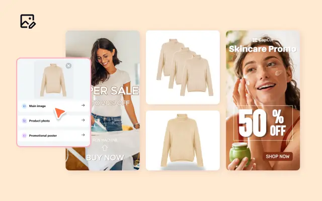
Image Editor
Your go-to tool for creating and editing images with ease.
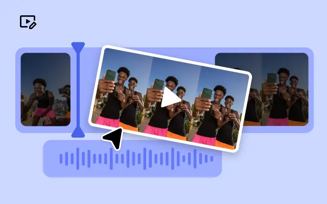
Quick Cut
Speed up video editing by transcribing and editing directly from text.

Remove Background
Instantly remove backgrounds from images with one click.
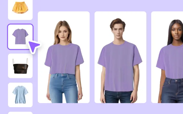
AI Model
Showcase your clothing on AI models for an immersive try-on experience.
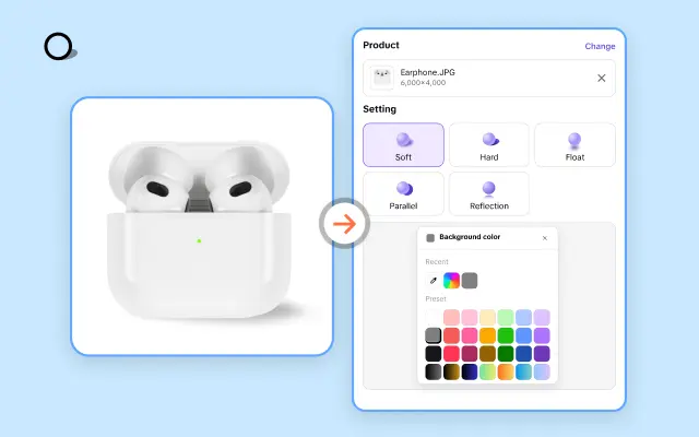
AI Shadows
Add lifelike shadows and lighting to products for enhanced realism.
About Template Width
Finding the perfect fit for your brand’s visual story can feel like a constant balancing act. Whether you’re designing a video for social media, an ad campaign, or a product spotlight, every detail counts — especially the dimensions. Incorrect template widths can lead to frustrating cropping or an unprofessional look. That’s where Pippit steps in to make your editing process both seamless and precise.
With Pippit’s intelligent template width options, crafting multimedia content that fits every platform is easier than ever. Our platform offers ready-to-use templates designed to meet the resolution and width specifications of popular channels, from Instagram Stories to YouTube thumbnails and everything in between. Worried about specific branding needs? You can fully customize the width of any template to ensure it perfectly aligns with your unique creative vision.
What sets Pippit apart is the flexibility and precision it provides. Adjusting template widths is no longer a guessing game — our user-friendly interface allows you to tweak dimensions with pinpoint accuracy. Plus, you’ll get instant previews, so you can see exactly how your finished project will appear across devices. Whether you need a landscape, portrait, or square format, Pippit empowers you to seamlessly shift between them with just a few clicks.
Say goodbye to the frustrations of resizing projects for multiple platforms. Instead, save time and maintain a professional look across all your media with Pippit’s adaptive templates. Ready to create consistently stunning videos and visuals? Start your free trial today and explore the width flexibility of Pippit templates!


