Stats Begin 2025 Vs End
Unlock your growth story! Compare stats from 2025’s start to year-end using Pippit’s tools—spot trends, refine strategies, and scale your e-commerce success.

80 results found for "Stats Begin 2025 Vs End"
Videos
Images
start,end 2025
start,end 2025
#fyp#trend#foryou
start of 2025
start of 2025
end of 2025 #trend #viral #fyp
Start 2025 end 2025
Start 2025 end 2025
#trend #fyp #lanceclyde #globalaidc
end of 2025
end of 2025
#startandendof2025#hazel_gray#fyp#trending#glowup
start2025end2025
start2025end2025
#viraltiktokaudio#fyp#viral#trend#use_and_export#use
me in 2025
me in 2025
#mein2025
peopleimtaking2026
peopleimtaking2026
#2026 #viral #trending
start end 2025
start end 2025
#fyp#trend#viral#trending#capcut
Start 2025 end 2025
Start 2025 end 2025
#trend #fyp #torres #globalaidc
Start-End of 2025
Start-End of 2025
#viralgroup #style #fyp #foryou #2025
Start2025End2025
Start2025End2025
#trend #makeitviral #fyp #beforeandnow #transition
Start of 2025
Start of 2025
#fyp#trend#viral
end of 2025
end of 2025
#lifegrowth#transition#velocity#goodbye2025
it's almost 2026
it's almost 2026
#viral#trending#fyp
start and end 2025
start and end 2025
#lifegrowth#goodbye2025#transition#viral
Start 2025, end 2025
Start 2025, end 2025
#trend #fyp #torres #globalaidc
start 2025, end 2025
start 2025, end 2025
#trend#fyp#torres#globalaidc
start2025end2025
start2025end2025
#fyp#viral#trend# use_and_export#usenow#use
start 2025 end of 20
start 2025 end of 20
#startof2025#tiktoktrend#trend#viral#fyp
different year
different year
#differentyear
start/end of 2025
start/end of 2025
#fyp #trendtiktok #makeitviral
Start 2025, end 2025
Start 2025, end 2025
#trend #fyp #torres #globalaidc
Start 2025 end 2025
Start 2025 end 2025
#trend #fyp #torres #globalaidc
Start of 2025 to end
Start of 2025 to end
#fyp#trend#makeittrend#viral#foryou#UStrendtemplate
start with 2024 end
start with 2024 end
#trend#foryou
me in 2025
me in 2025
#mein2025
Start and end 2025
Start and end 2025
#2025#start#end#usa#ustemplate
start and end 2025
start and end 2025
#fyp#trend #foryou
start of 2025
start of 2025
#fyp#trend#viral
Start of 2025
Start of 2025
#fyp#foryou#trend#viral#makeittrend
start with 2024 end
start with 2024 end
#trend#foryou
Me in 2025
Me in 2025
#mein2025
i'm taking in 2026
i'm taking in 2026
#fyp#viral#foryou#makeittrend#UStrendtemplate
START AND END 2025
START AND END 2025
#startandendof2025#2025#glowup#challenge#viralUS
Start 2025, end 2025
Start 2025, end 2025
#trend #fyp #torres #globalaidc
start of 2025
start of 2025
#startof2025#fyp#trending
StartAndEndOf2025
StartAndEndOf2025
#startof2025#endof2025#glowupus
Start of 2025
Start of 2025
#makeitviral#fyp#nicx#trend
start nd end of 2025
start nd end of 2025
#2025#glowup#ustemplate#trend
different year
different year
#differentyear.

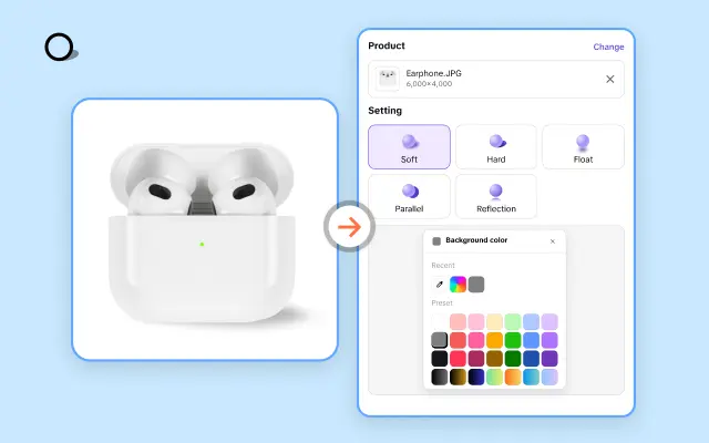
All the Smart Tools You Need to Streamline Your Content Creation

Video Editor
A powerful all-in-one video editing tool packed with features.

Sales Poster
Effortlessly create AI-powered promotional posters for your products.

Smart Crop
Crop videos to perfectly fit any platform's aspect ratio.
Custom Avatar
Create your own unique digital avatar for a personalized touch.
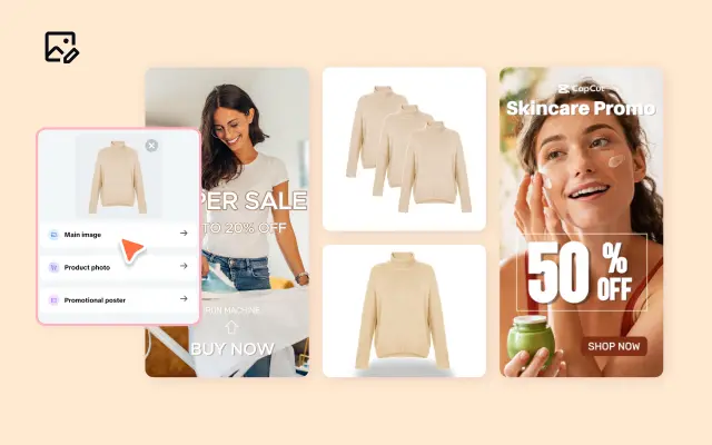
Image Editor
Your go-to tool for creating and editing images with ease.

Quick Cut
Speed up video editing by transcribing and editing directly from text.

Remove Background
Instantly remove backgrounds from images with one click.
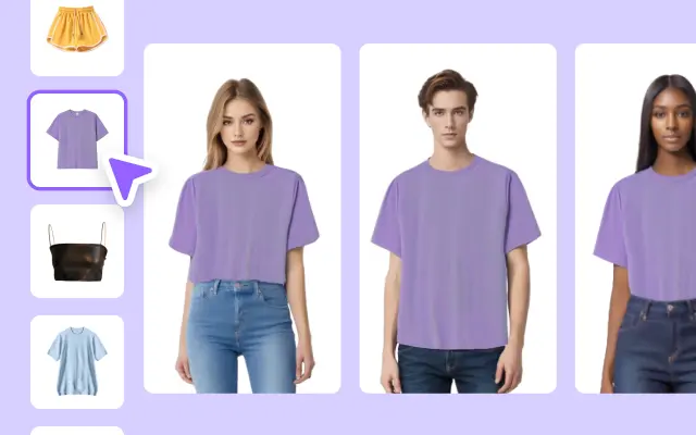
AI Model
Showcase your clothing on AI models for an immersive try-on experience.
AI Shadows
Add lifelike shadows and lighting to products for enhanced realism.
About Stats Begin 2025 Vs End
Are you ready to turn numbers into compelling narratives? If you're mounting a campaign or analyzing performance, there's no better way to showcase success than through the right stats. But here's the challenge: presenting raw data professionally, engagingly, and creatively isn't always straightforward. That's where Pippit steps in to revolutionize how you visualize your stats from beginning to end—say goodbye to bland spreadsheets and hello to impactful video storytelling.
With Pippit's expansive collection of templates, you can craft visuals that demonstrate growth, highlight trends, and emphasize achievements from "Stats Begin 2025" to "Stats End 2025"—all in a single, seamless video presentation. Whether you're tracking revenue increases, website traffic, customer engagement, or project milestones, Pippit helps you visualize your data with style and clarity. Use vibrant charts, sleek animations, and striking infographics that leave a lasting impression on your audience. Plus, with user-friendly tools, you can tweak every template to reflect your business's unique brand identity.
Imagine showcasing your stats as an interactive and engaging story. Pippit lets you break down complex numbers effortlessly and presents your metrics in ways that resonate. Highlight growth trajectories, compare beginning vs. end results side-by-side, and transform ordinary stats into dynamic video updates perfect for presentations, social media, or internal reporting. With drag-and-drop editing, pinpoint precision, and customizable text overlays, it takes just minutes to make your stats look professional and stand out.
Ready to make your stats pop? Jump into Pippit today to access premium templates designed for every business need. Sign up now and gain instant access to tools that turn data into visual magic. Your 2025 stats deserve more than a spreadsheet—let Pippit help you create something extraordinary. Start your journey now!


