Start Year vs End Year
Compare growth like a pro! Pippit’s customizable templates let you showcase your Start Year vs End Year data visually—make trends pop and impress effortlessly.

80 results found for "Start Year vs End Year"
Videos
Images
start vs. end year
start vs. end year
#truefriends
Start and end 2025
Start and end 2025
Start and end of 2025
Start vs End of 2025
Start vs End of 2025
#startvsendof2025#becauseilikedaboy#glowup#trend#fypus
start 2025 end 2025
start 2025 end 2025
#2025 #glowup #trend #fyp
start & end of 2025
start & end of 2025
#startof2025 #endof2025 #differentpeople #pov
2024/2025
2024/2025
#fyp#trend#viral
schoolyearend
schoolyearend
#schoolyearend#endofschool#trend#editbyhans
Start VS End Year
Start VS End Year
#friendship #trend #newyear
Start vs end 2025
Start vs end 2025
#proviral #trend #us #2025
start and end 2025
start and end 2025
#trend #fyp #makeitviral #startof2025 #transition
Start of 2025
Start of 2025
#viraltiktokaudio#fyp #foryou #trend
Start of 2025
Start of 2025
#trendingnew #fypcapcut #foryou
2023/2025
2023/2025
#foryou#fyp#trend#viral
change in a year
change in a year
#chnageinayear#glowup#ustemplate
Start and end trand
Start and end trand
#trand #startandendof2023
START/END OF 2025
START/END OF 2025
#startof2025#endof2025#endofyear#trend#transition
Star&end 2025
Star&end 2025
#glowup #trend #viral #fyp
End/start of 2025
End/start of 2025
#2025 #fyp #trend #viral #lexii
start & end 2025
start & end 2025
#use#trend#viral#fyp
2025 vs 2026
2025 vs 2026
#lifegrowth #2025vs2026 #beforeafter #2video #2clips
2 years
2 years
#glowup#2years#trend
start vs end of 2025
start vs end of 2025
#proviral#startvsendof2025#startvsendoftheyear#trend
Start vs End of 2025
Start vs End of 2025
#startvsendof2025#glowup#trend#viral#fypus
start & end 2025
start & end 2025
#us
start end of 2025
start end of 2025
#lifegrowth#endof2025#viral
Start of 2025
Start of 2025
#trend #fyp #viral #trending #foryou
December2024vs2025
December2024vs2025
#december2024vs2025#2024vs2025#glowup#viral#us
start vs end of 2025
start vs end of 2025
#trending#startvsendof2025
#fyp#jReys
start vs end of 2025
start vs end of 2025
#kenjohn#fyp#viral
start and end 2025
start and end 2025
#lifegrowth#goodbye2025#transition#viral
start & end of 2025
start & end of 2025
#trend|#glowup|#startandendof2025|#rovic
Start of 2025
Start of 2025
#trendingnew #fypcapcut #foryou
December2024&2025
December2024&2025
#trend #fyp #makeitviral #transition #december
StartVsEndOf2025
StartVsEndOf2025
#fyp #trend #startvsendof2025 #viral #usenow
start 2025,end 2025
start 2025,end 2025
#startvsend#glowup#fyp#trending#foryoupage
start and end of2025
start and end of2025
#kenjohn#fyp#viral
start & end of 2025
start & end of 2025
#glowup #trend #viral #fyp
start / end of 2025
start / end of 2025
#lifegrowth#2025recap#viral
Start vs end school
Start vs end school
#school #glowup #yourphoto #capcut
1yearWontChangeYou.
1yearWontChangeYou.
#1yearwontchangeyou#glowup#viral#trend#us

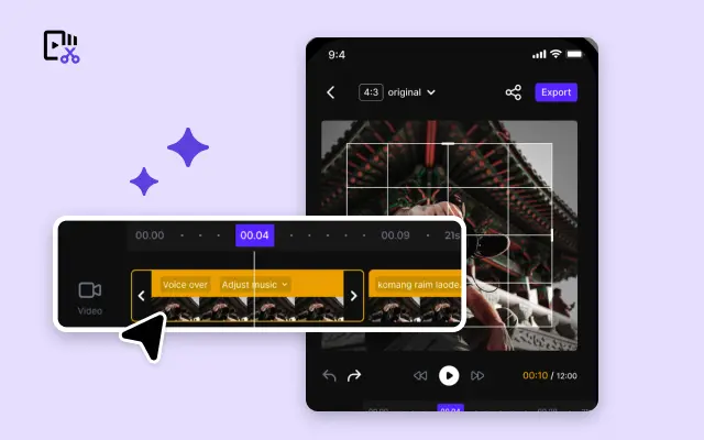
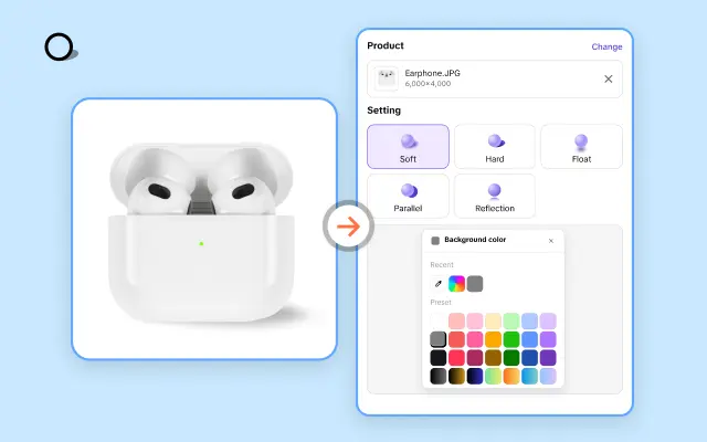
All the Smart Tools You Need to Streamline Your Content Creation

Video Editor
A powerful all-in-one video editing tool packed with features.

Sales Poster
Effortlessly create AI-powered promotional posters for your products.

Smart Crop
Crop videos to perfectly fit any platform's aspect ratio.
Custom Avatar
Create your own unique digital avatar for a personalized touch.
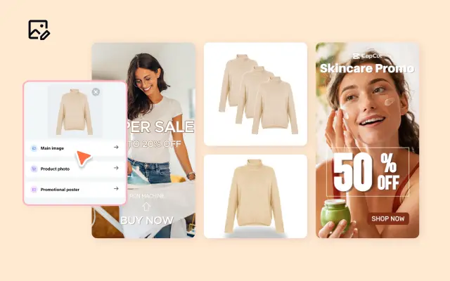
Image Editor
Your go-to tool for creating and editing images with ease.
Quick Cut
Speed up video editing by transcribing and editing directly from text.

Remove Background
Instantly remove backgrounds from images with one click.
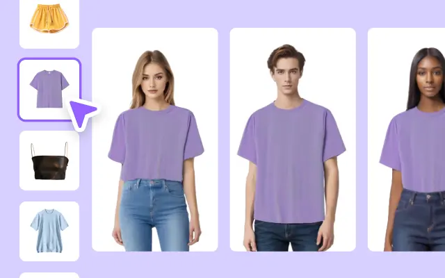
AI Model
Showcase your clothing on AI models for an immersive try-on experience.
AI Shadows
Add lifelike shadows and lighting to products for enhanced realism.
About Start Year vs End Year
Are you struggling to effectively showcase your brand's growth or performance over time? With so many reports, presentations, and marketing materials to create, illustrating "Start Year vs End Year" trends can feel daunting. That’s where Pippit steps in to simplify the process with its intuitive and powerful editing platform.
Pippit’s customizable templates make it incredibly easy to illustrate your business journey from the starting year to the current year—or any two points in time. Whether you're tracking sales growth, customer acquisition, or key milestones, our professionally designed templates are ready for you to personalize. No graphic design degree? No problem. Pippit’s drag-and-drop interface ensures that even beginners can confidently create charts, infographics, and compelling visuals that clearly communicate your brand’s progress to stakeholders or customers.
With Pippit, you can dive right into your project instead of wasting hours fiddling with clunky tools. Our platform offers hundreds of ready-to-use templates tailored for start-to-end year comparisons. Want a clean and professional bar graph? Or perhaps a sleek timeline to map out your company’s journey year by year? Whatever you envision, Pippit has a template to bring it to life. Plus, you can add your brand colors, logos, and fonts to ensure your visuals align perfectly with your style.
By turning data into captivating visuals, you can keep your audience engaged and make a lasting impression. Data storytelling has never been easier—or faster. With Pippit, you can elevate your presentations, pitch decks, and social media posts with proven tools designed to save you time while delivering top-tier results.
Ready to bring your "Start Year vs End Year" story to life? Let Pippit guide you. Sign up today for free, and explore our growing library of exclusive templates. Start creating engaging visuals that highlight your success and inspire your audience to take action!


