Small Screen Templates for Video 9 10
Create scroll-stopping video content for smaller screens effortlessly! Pippit's customizable templates fit perfectly—just tweak, polish, and captivate your audience in seconds. Start creating today!
80 results found for "Small Screen Templates for Video 9 10"
Videos
Images
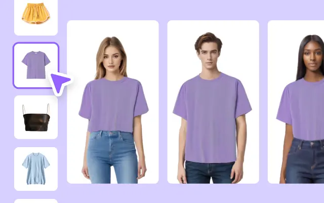
Women's Clothing Display In Small Screen
Women's Clothing Display In Small Screen
Clothes, Women, Female, Fashion, Vogue, Product Display. Take your ad videos to the next level.
Chill phong cảnh
Chill phong cảnh
8 video ngang #chill#phongcanh
MIMOSA 2000
MIMOSA 2000
#mimosa2000 #cinematic #aesthetic #transition #trending
☘️Video Creative Brief for St. Patrick's Day
☘️Video Creative Brief for St. Patrick's Day
Clothes, Clothing Display In Small Screen Fashion, Vogue, Product Display. Take your ad videos to the next level.
Christmas Happy
Christmas Happy
#christmas#happy#cinematic#fyp
Vlog chill 11 video
Vlog chill 11 video
#topcreator #xh #chill #capcutmaster #huutuyen77
Food Show Promo In Small Screen
Food Show Promo In Small Screen
TikTok Style, Food Show, Dishes, Coffee, Desserts, Sale, Product Display. Getprofessional-looking ads in minutes.
Spring Sale Men's Clothing Display In Small Screen
Spring Sale Men's Clothing Display In Small Screen
Clothes, Men, Male, Fashion, Cool, Product Display. Boostyour video ads with our template.
TikTok Style Screen Display Clothing
TikTok Style Screen Display Clothing
#fashiom#cc4b#promotiontemplates#clothing#tiktoktrending🔥
august moment
august moment
#augustdump#minivlog#trends#makeitviral#cinematic
TikTok style Clothing Sales Small Screen
TikTok style Clothing Sales Small Screen
TikTok Style, Fashion, Girls,Young, Sale, Clothing,Clothes,Product Display.Get professional-looking ads in minutes.
moments
moments
#moments #moments📸 #vlog #dailyvlog #protrend
transition full
transition full
#transition #cinematic #fyp#viral#trend#trending
Vlog Christmas
Vlog Christmas
#vlog #xmas2024 #mauprohq #prohq #huutuyen77
Merry Christmas ☃️
Merry Christmas ☃️
#winter2025 #merrychristmas2025 #EUprochallenge #vlog
scrolling template
scrolling template
#scrollingtemplate #aesthetictamplate #landscapevideo
grid 4 clips
grid 4 clips
#templatestormldr
Digital Appliances, Small Appliances, Minimalist, Business Templates.
Digital Appliances, Small Appliances, Minimalist, Business Templates.
Digital Appliances, Small Appliances, Minimalist, Business Templates. Make your ads more engaging with our video template.
Women's Clothing Display In Small Screen
Women's Clothing Display In Small Screen
TikTok Style, Clothes, Women, Female, Fashion, Vogue. Boost your video ads with our template.
Chic INS Home INS Style Business Templates
Chic INS Home INS Style Business Templates
Chic INS Home, New Arrivals, Minimalism, Split Screen Display, Elevate your video ads with our templates.
a day in my life
a day in my life
#foryou#fyp#capcuthq#vlog#minivlog
Cinematic Christmas
Cinematic Christmas
#my2025story#cinematic#christmas#december
Digital Appliances, Small Appliances, Minimalist, Business Templates.
Digital Appliances, Small Appliances, Minimalist, Business Templates.
Digital Appliances, Small Appliances, Minimalist, Business Templates. Make your ads more engaging with our video template.
Intro-Christmas Vlog
Intro-Christmas Vlog
#yt_templates #christmas #vlog #intro
Spring Sale Men's Clothing Display In Small Screen
Spring Sale Men's Clothing Display In Small Screen
Clothes, Men, Male, Fashion, Cool, Product Display. Boost your video ads with our template.
the beach is calling
the beach is calling
#fyp#minivlog#cinematic #holiday#beach#travel
Aesthetic Cinematic
Aesthetic Cinematic
#aesthetic #cinematic #status #trend
aesthetic film vlog
aesthetic film vlog
#aesthetic #vlog #vintage #film #foryou
MINI VLOG CINEMATIC
MINI VLOG CINEMATIC
#vlog#cinematic#minivlog#stories#dailyvlog
Back to school Vlog🏆
Back to school Vlog🏆
#livelove #backtoschool2025 #cinematic #schoolvlog
slice of life
slice of life
#cinematic#sliceoflife#life
Cinematic
Cinematic
Pemandangan #10klip #pemandangan #protrend
Food Product Display In Small Screen
Food Product Display In Small Screen
Tiktok Style, Food Show Birthday Cake, Desserts, Product Display.
Try our template
#capcutforbusiness
#food
10 CLIP'S CINEMATIC
10 CLIP'S CINEMATIC
#kane#viral#hazhel#fypage#trends
Dynamic Transition
Dynamic Transition
#transition#transitiontrend#cinematic#aesthetic#vlog
Merry Christmas
Merry Christmas
#fyp#christmas#vlog#merrychristmas#protemplate
Peaceful Earth
Peaceful Earth
#vlog #minivlog #trendtemplate #landscape #nature
christmas scrolling
christmas scrolling
#lifegrowth #christmas2025 #scrolling #christmasvlog
Frame Vlog aesthetic
Frame Vlog aesthetic
#fyp#frame#vlog#intro#cinematic
Cinematic vlog
Cinematic vlog
#cinematicvlog#vlog#travel#sad#cinematic#trend

All the Smart Tools You Need to Streamline Your Content Creation
Video Editor
A powerful all-in-one video editing tool packed with features.
Sales Poster
Effortlessly create AI-powered promotional posters for your products.
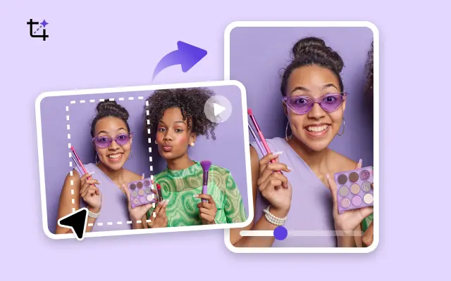
Smart Crop
Crop videos to perfectly fit any platform's aspect ratio.
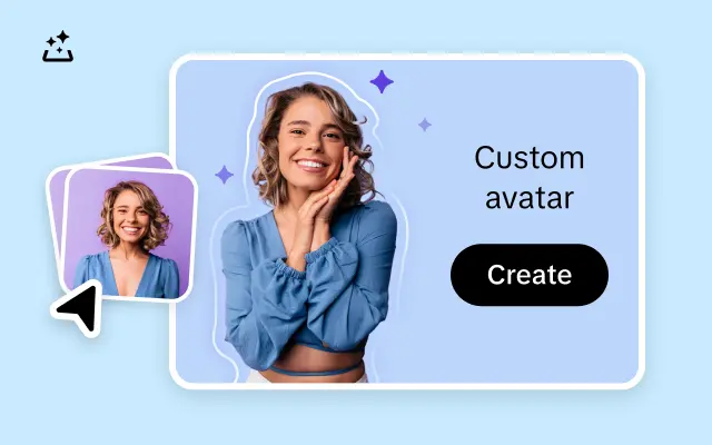
Custom Avatar
Create your own unique digital avatar for a personalized touch.
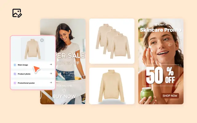
Image Editor
Your go-to tool for creating and editing images with ease.
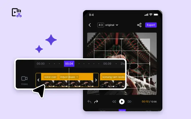
Quick Cut
Speed up video editing by transcribing and editing directly from text.
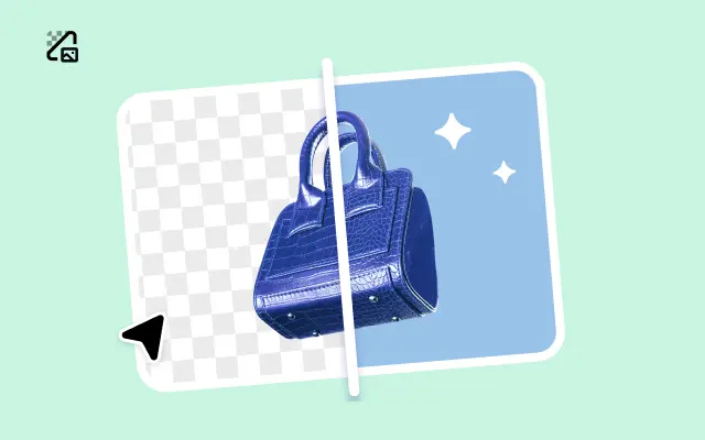
Remove Background
Instantly remove backgrounds from images with one click.
AI Model
Showcase your clothing on AI models for an immersive try-on experience.
AI Shadows
Add lifelike shadows and lighting to products for enhanced realism.
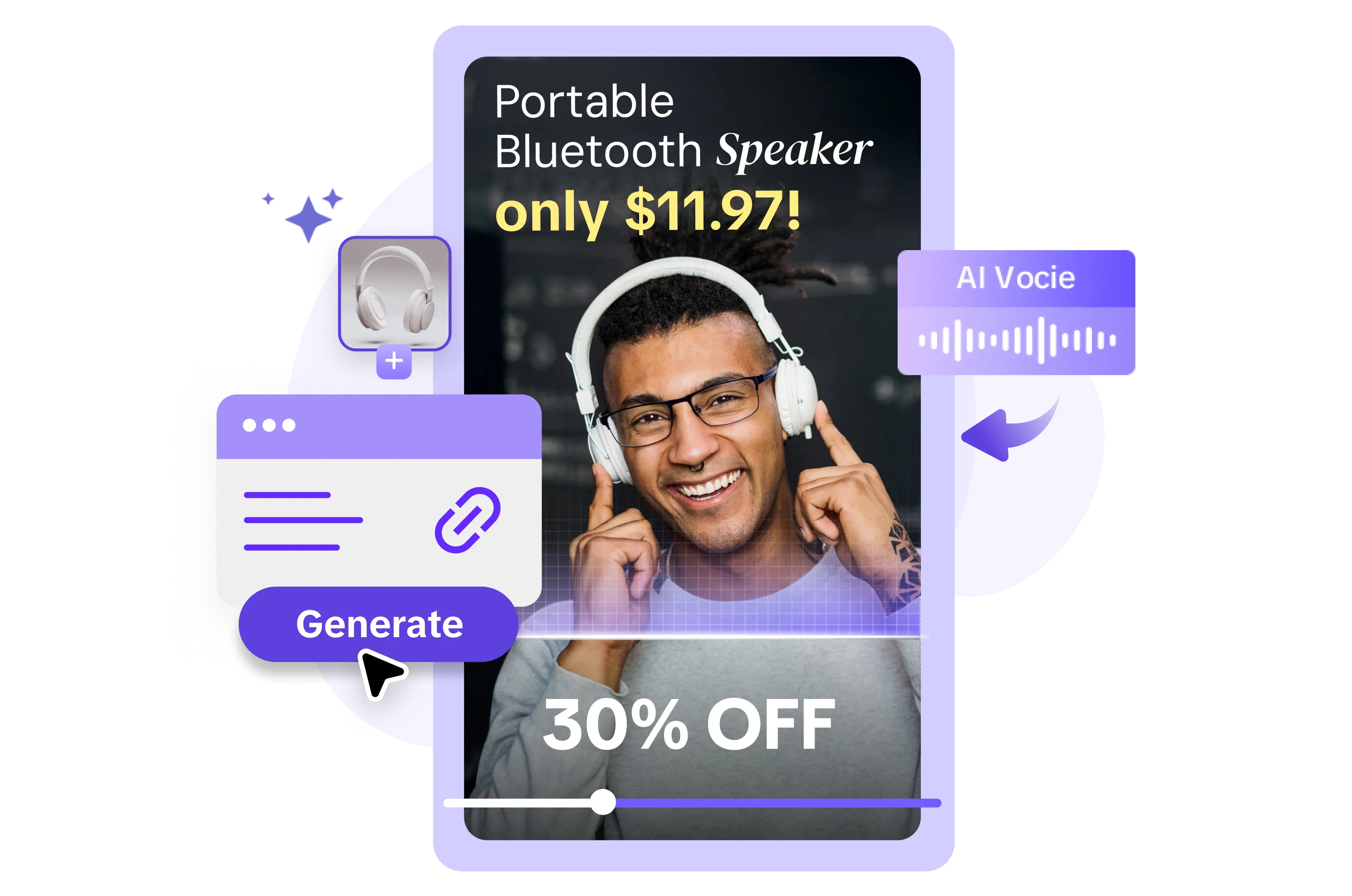
About Small Screen Templates for Video 9 10
In today’s digital landscape, capturing attention on mobile devices is no longer optional—it’s essential. With audiences glued to their small screens, creating videos that grab attention on smartphones and tablets can set your brand apart. But how do you ensure your videos stand out on a tiny display? That’s where Pippit’s small screen templates for video come in, optimized specifically for mobile experiences on devices like the iPhone 9, 10, and beyond.
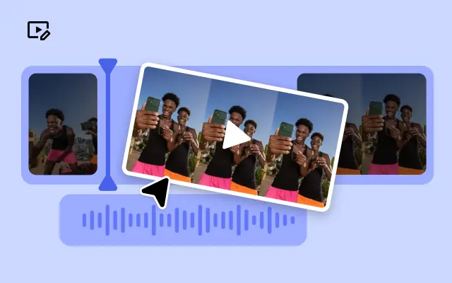
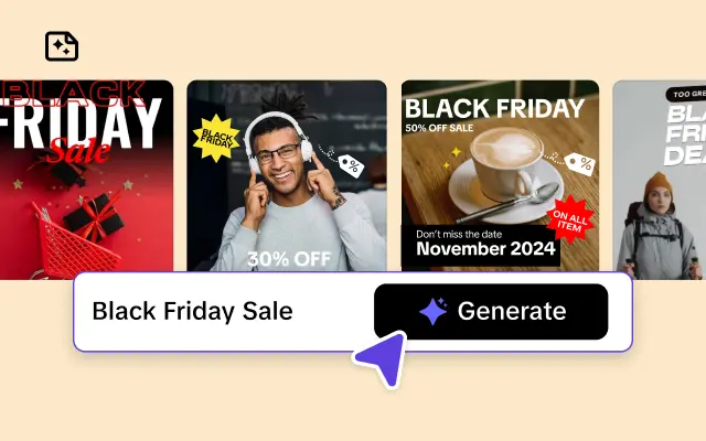
Pippit takes the guesswork out of creating high-quality, mobile-friendly videos. Our small screen templates are expertly designed with proportions, text sizes, and layouts that ensure your content looks flawless on any smartphone. Whether you’re crafting Instagram Stories, product showcases, or Facebook ads, we’ve got customizable templates that are not just visually appealing but conversion-driven. You don’t need to be a tech wizard or a creative guru—our drag-and-drop editor lets you seamlessly add personalized text, transitions, or music to make your message pop.
The benefits go beyond aesthetics. Mobile-first video design enhances viewer engagement, retention rates, and click-throughs. Our templates guarantee a perfect fit for small screens, eliminating awkward cropping or shrunken text that can distract from your message. Visualize crisp product demos, compelling social media teasers, or message-driven explainer videos—all with consistent formatting guaranteed to resonate with mobile users. This way, you’re not just creating videos; you’re creating an efficient brand experience.
Why wait to create videos that captivate even the most distracted thumb-scrollers? With Pippit, you can take advantage of our small screen templates today and start making a bigger impact. Sign up now for access to our intuitive platform and start turning small screens into big opportunities. Your audience—and your business—will thank you.


