Small Ratio Screen
Design stunning content for small ratio screens effortlessly. Pippit's responsive templates ensure your visuals shine on every device—delivering a seamless, professional look instantly.
80 results found for "Small Ratio Screen"
Videos
Images
versi no lyrics
versi no lyrics
#smoothslowmo#slowmosmooth
formatting
formatting
#nine-square grid
[16.9] SEASONS REMIX
[16.9] SEASONS REMIX
写真2枚!#冬模様 #音ハメ #royvns
Cinematic WithoutYou
Cinematic WithoutYou
ganti teks nya👆
#trend #aesthetic#CapCutTopCreator
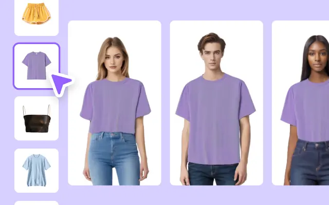
Spring Sale Men's Clothing Display In Small Screen
Spring Sale Men's Clothing Display In Small Screen
Clothes, Men, Male, Fashion, Cool, Product Display. Boost your video ads with our template.
TINH VE JAPANDEE
TINH VE JAPANDEE
TINH VE | 以前のテンプレはバグでエフェクトが消えていたため、再投稿しました。#自作発言ok #ベトナ
soundkece nih
soundkece nih
#jjtipis#fyp
lạc lạc lạc
lạc lạc lạc
lạc vào khu rừng hoa remix #mtis #mauai
4×4
4×4
#fyp#fredalyn
nine-square grid
nine-square grid
#join together
SplitTScreen
SplitTScreen
Transition🔥 #splitscreen#spliteffect#transition#trend
🎵everywhere we go
🎵everywhere we go
#fyp#tangtoc
Interface
Interface
Big dawgs🔥#interface#bigdawgs#trend#capcut#aesthetic
Move square
Move square
1 photo
TikTok style Clothing Sales Small Screen
TikTok style Clothing Sales Small Screen
TikTok Style, Fashion, Girls,Young, Sale, Clothing,Clothes,Product Display.Get professional-looking ads in minutes.
6:44
6:44
#fyp#aezi
☘️Video Creative Brief for St. Patrick's Day
☘️Video Creative Brief for St. Patrick's Day
Clothes, Clothing Display In Small Screen Fashion, Vogue, Product Display. Take your ad videos to the next level.
city lights 🌃
city lights 🌃
#discord #discordreels #squareretro #trend #jayemesdee
FORSCREEN
FORSCREEN
#merang #fyp
Food Show Promo In Small Screen
Food Show Promo In Small Screen
TikTok Style, Food Show, Dishes, Coffee, Desserts, Sale, Product Display. Getprofessional-looking ads in minutes.
Spring Sale Men's Clothing Display In Small Screen
Spring Sale Men's Clothing Display In Small Screen
Clothes, Men, Male, Fashion, Cool, Product Display. Boostyour video ads with our template.
MẪU NGANG
MẪU NGANG
#maupro #viral✨ #fyp
versi no mirror
versi no mirror
#viral#jjtipiskece#februarigolden2023#mlbb#fypツ
Moving Squares
Moving Squares
#squares #geometric #proeditor #trendingtemplate #pro
nhạc xịn quá 😚
nhạc xịn quá 😚
give me your love remix / mẫu ngang #nd #gamelife
template square
template square
#templatecaput#fypcapcut🔥🔥🔥#hothastagtemplate
Women's Clothing Display In Small Screen
Women's Clothing Display In Small Screen
Clothes, Women, Female, Fashion, Vogue, Product Display. Take your ad videos to the next level.
Polos | square
Polos | square
#foryouuuu #fyp
Message In A Bottle
Message In A Bottle
#messageinabottle #vlog #prohq #chill #huutuyen77
Caption chill 🌿
Caption chill 🌿
#1video #chill #huutuyen77 #xuhuong #prohq
Mẫu 2 ảnh ngang
Mẫu 2 ảnh ngang
#xhuong📌#season x nevada🔥
soundkece nih
soundkece nih
#jjtipis#fyp
Square 2
Square 2
#square #blackmoodfilter #overlayeffect #proeffects
Food Product Display In Small Screen
Food Product Display In Small Screen
Tiktok Style, Food Show Birthday Cake, Desserts, Product Display.
Try our template
#capcutforbusiness
#food
Women's Clothing Display In Small Screen
Women's Clothing Display In Small Screen
TikTok Style, Clothes, Women, Female, Fashion, Vogue. Boost your video ads with our template.
Chill 4 video + màu
Chill 4 video + màu
#CapCutEOY2023 #huutuyen77 #capcuthq #chill #tamtrang
null template!!
null template!!
📸10枚#null #バズりテンプレート
template
template
📸5枚
mẫu ngang cực cuốn😋
mẫu ngang cực cuốn😋
las vegas remix #nd #mtis #topcreator
MLBB Profile
MLBB Profile
#mobilelegends#beatmaster#trending#dvorayeditz

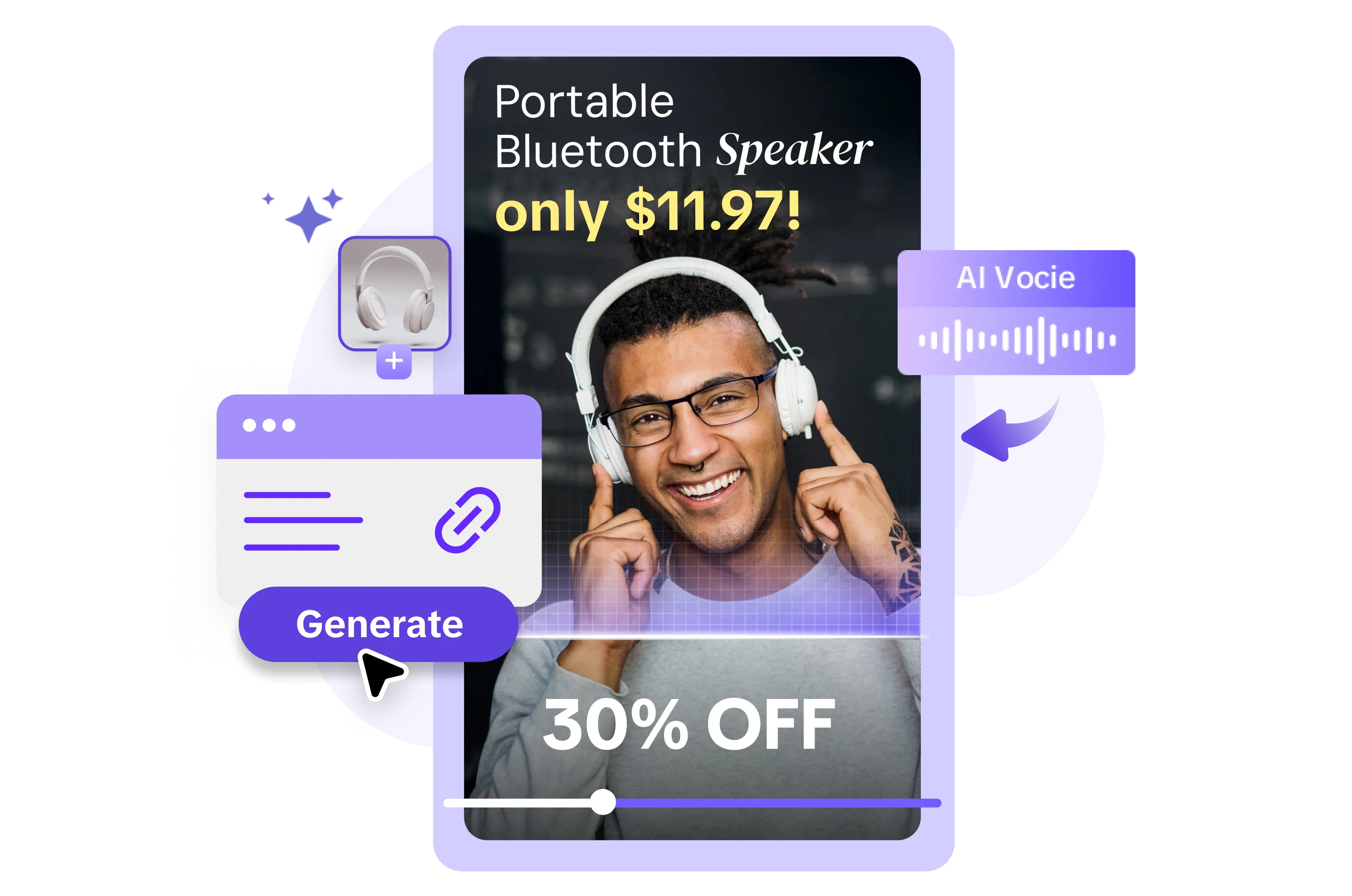
All the Smart Tools You Need to Streamline Your Content Creation
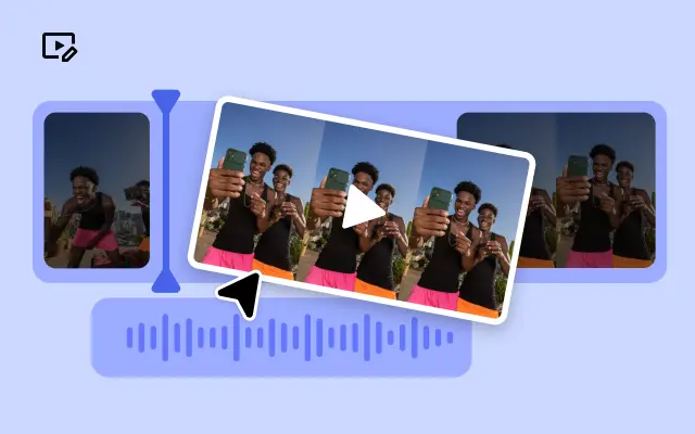
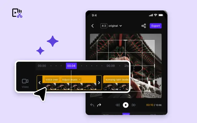
Video Editor
A powerful all-in-one video editing tool packed with features.
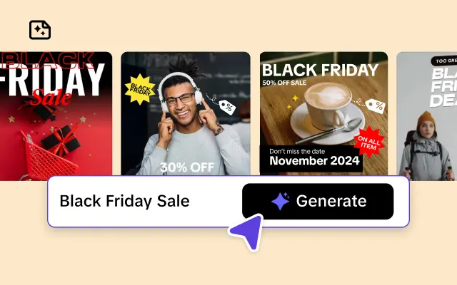
Sales Poster
Effortlessly create AI-powered promotional posters for your products.
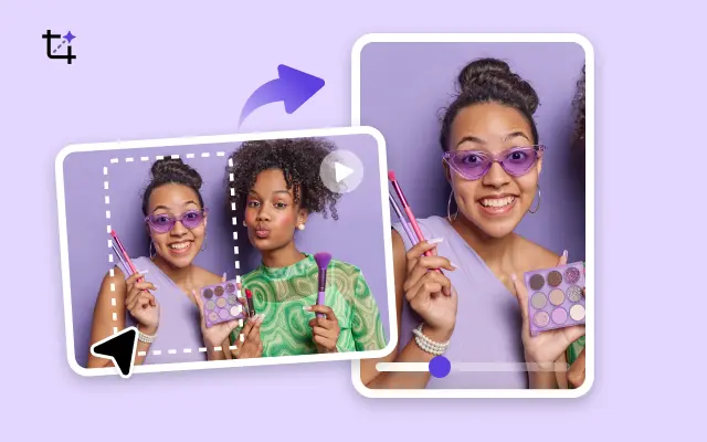
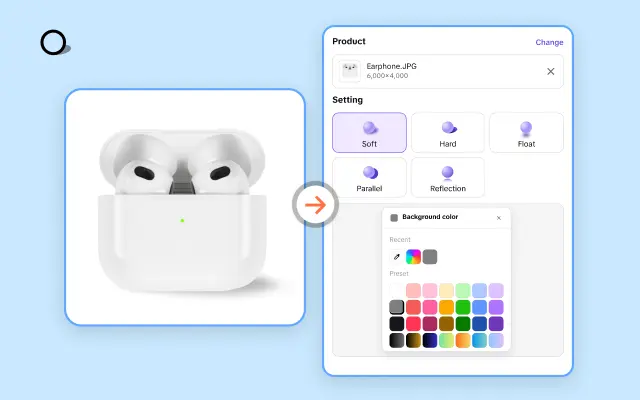
Smart Crop
Crop videos to perfectly fit any platform's aspect ratio.
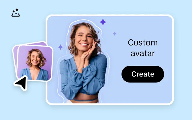
Custom Avatar
Create your own unique digital avatar for a personalized touch.
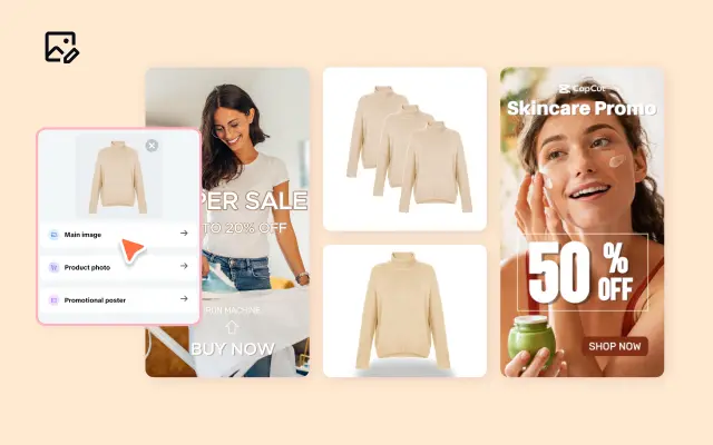
Image Editor
Your go-to tool for creating and editing images with ease.
Quick Cut
Speed up video editing by transcribing and editing directly from text.
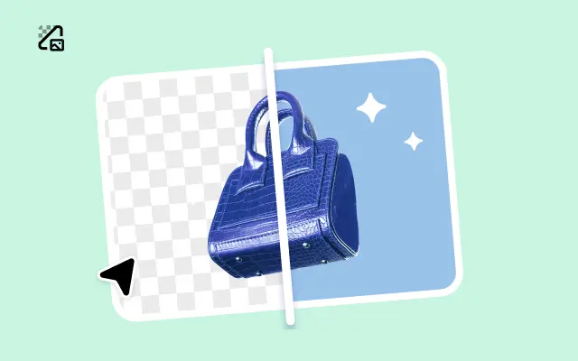
Remove Background
Instantly remove backgrounds from images with one click.
AI Model
Showcase your clothing on AI models for an immersive try-on experience.
AI Shadows
Add lifelike shadows and lighting to products for enhanced realism.
About Small Ratio Screen
Say goodbye to wasting precious screen space with Pippit! If you're working on digital content for small screens, you know how critical it is to maximize your canvas while maintaining a captivating design. Enter Pippit's Small Ratio Screen templates—your secret weapon for creating high-quality, perfectly formatted videos and multimedia content tailored to smaller displays. Whether you're making Instagram Stories, mobile ads, or app-focused tutorials, Pippit is here to help you create content that doesn’t just fit—it shines.
With Pippit’s advanced Small Ratio Screen templates, you can effortlessly design stunning visuals that make the most of every inch of screen space. Our platform offers an intuitive drag-and-drop interface, so you won’t need design experience to create professional-grade content. From 9:16 vertical videos for social media to compact layouts for mobile-first campaigns, Pippit ensures your content looks flawless regardless of size. You’ll also find resizing features that instantly adjust designs for different small-screen devices, saving you both time and effort.
The benefits don’t stop at simplicity—Pippit is loaded with pre-designed elements optimized for small ratios. Our templates are built with readability, aesthetic balance, and viewer engagement in mind, so your content will stand out on even the tiniest screens. Want to add your branding? You can easily customize fonts, colors, and logos directly on the platform. Pippit empowers you to keep your brand's visual identity intact, even on scaled-down canvases.
So why wait to perfect your small-screen content strategy? Start today with Pippit’s Small Ratio Screen templates and produce eye-catching videos in minutes. Sign up now to explore our tools and discover unparalleled ease in creating multimedia that captivates viewers—no matter the size of their screens!


