Screen Size Template 3.4 Inches
Showcase your products perfectly! Our 3.4-inch screen size templates adapt seamlessly—customize layouts effortlessly for mobile-friendly, pro-level visuals that captivate your audience.
80 results found for "Screen Size Template 3.4 Inches"
Videos
Images
Storytime
Storytime
#gayainovasi#storytime#quotes#bahansw#fyp
bahan sw
bahan sw
#fyp
the best thing
the best thing
#quotesforyourself#quotes#viral#capcut#fyp
imagine praying
imagine praying
#quotes#viral#capcut#fyp#viralcapcut🔥
New Arrivals Fashion Vlog Screen Recreation TikTok Style
New Arrivals Fashion Vlog Screen Recreation TikTok Style
This template create for new arrivals fashion and tiktok style. Boost your ad campaign with easy-yo-use template. Try it Now! #fashion #clothing #newarrivals #tiktokstyle #screen #vlog
Fashion New Arrivals Screen Recreation TikTok Style
Fashion New Arrivals Screen Recreation TikTok Style
This template create for fashion new arrivals screen recreation tiktok style. Boost your ad campaign with easy-yo-use template. Try it Now! #fashion #clothing #tiktokstyle #screen #phone #newarrivals
quotes story
quotes story
#statusharian #storywa #quotes
story whatsapp
story whatsapp
#fуρ
there's a saying
there's a saying
#quotes#fyp#motivational#foryou#motivation
aamiin
aamiin
#storywa #quotesstory #statusharian #storywa #quotes
Nail Product Screen Display Tiktok Style
Nail Product Screen Display Tiktok Style
Best Seller, Must Have, Mus Try, Best Sale, Buy One Get One Free, Big Sale, Sale Off, Promo Poster. Create ad videos that convert with our customizable template.
Orange-yellow and White Real Estate Just Listed Promotion Template
Orange-yellow and White Real Estate Just Listed Promotion Template
Real Estate Industry, Orange-yellow and White, Multi-screen Display, Real Estate Just Listed. Boost your Ad Campaign with Our Easy-to-use Video Template!
Brush Cosmetics Phone Screen TikTok Style!
Brush Cosmetics Phone Screen TikTok Style!
Show your beauty and brush cosmetics by using this template! #fashiontemplate #fashion #cosmetic #brush #brushmakeup
storytime || 4 slide
storytime || 4 slide
#storytime#quotes#viral#bahansw#fyp
bahan swmu
bahan swmu
#hastag#fypcapcut
Kinetic Typography Gym Motivation
Kinetic Typography Gym Motivation
#kinetictypography #gymmotivation #gymtemplate #gymquotes #gymedit
story hari ini
story hari ini
#storywaharian#storyharian#trend#viral
Split Screen Auto Car Wash Promo Ads
Split Screen Auto Car Wash Promo Ads
Automobile, Car wash, Promo Ads, Split screen, Modern style, Video Template
Elegant & Minimalist Style Yoga Teaching Ads
Elegant & Minimalist Style Yoga Teaching Ads
Sports Industry, Smooth and Simple Transitions, Fashion, Split Screen. Use our template for unbeatable ad videos.
Lời ah hứa 🤣🤣🤣
Lời ah hứa 🤣🤣🤣
Mẫu 1 video 🔥🔥🔥
KATA KATA
KATA KATA
#quotesstory#trend#fyp
gaboleh lupa diri
gaboleh lupa diri
#fyp
just a quick reminde
just a quick reminde
#quotes#viral#capcut#fyp#friday
akan kuhadapi
akan kuhadapi
#templatecaput
makeup product display common contrast tiktok style
makeup product display common contrast tiktok style
makeup, split screen, before vs after, tiktok style. Create eye-catching ad videos with our customizable template.
Split Screen Specialty Auto Shops & Customization Instagram Ads
Split Screen Specialty Auto Shops & Customization Instagram Ads
#cars#repair#automotive# splitscreen.
make better ads with our template now
story whatsapp
story whatsapp
#fуρ
episode
episode
#paragraf
proses hidup
proses hidup
#storytime#status#kutipanquotes
diam
diam
#statusharian #storywa #quotes
story Time
story Time
#storytime #kutipanquotes
انت سيد الاسود 🖤
انت سيد الاسود 🖤
#اكسبلور #اكسبلورexplore
Spring Sale Men's Clothing Display In Small Screen
Spring Sale Men's Clothing Display In Small Screen
Clothes, Men, Male, Fashion, Cool, Product Display. Boostyour video ads with our template.
Men's Clothing Screen Recreation Tiktok Style
Men's Clothing Screen Recreation Tiktok Style
Men's clothing, screen cell phone, tiktok style, product display, want to make ad video that get results? Try our template today!
Storytime || 4 slide
Storytime || 4 slide
#protrend#storytime#quotes#bahansw#fyp
every day a new page
every day a new page
#quotesforyourself#quotes#viral#capcut#fyp
Sports Motivational Quotes
Sports Motivational Quotes
Take the hassle out of ad video creation with our customizable template
Story Opening
Story Opening
#memeopening#twogetherwithcapcut#teamta#2022recap#fyp
Women’s Fashion Screen Recorder Retro in TikTok Style
Women’s Fashion Screen Recorder Retro in TikTok Style
This template create for women’s fashion screen recorder retro in tiktok style. Boost your ad campaign with easy-yo-use template. Try it Now! #outfit #fashion #womens #screen #recorder #retro #tiktokstyle
🎵❤️🩹
🎵❤️🩹
#shah_afg #afghanedit

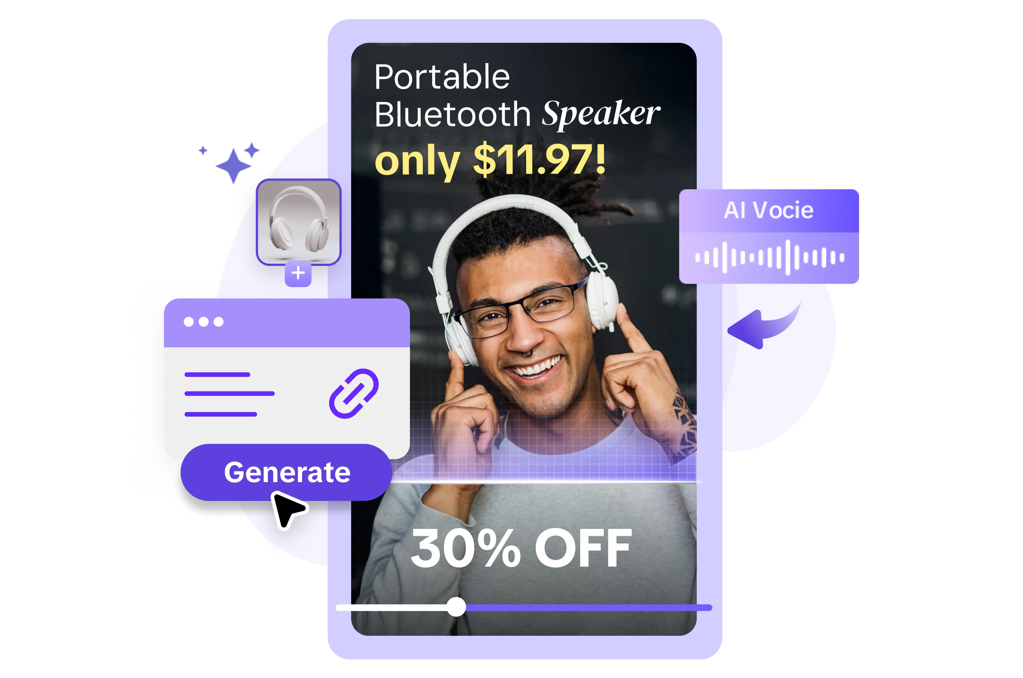
All the Smart Tools You Need to Streamline Your Content Creation
Video Editor
A powerful all-in-one video editing tool packed with features.
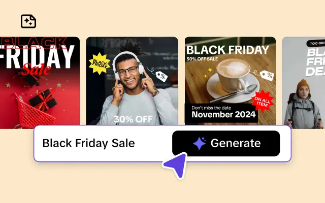
Sales Poster
Effortlessly create AI-powered promotional posters for your products.
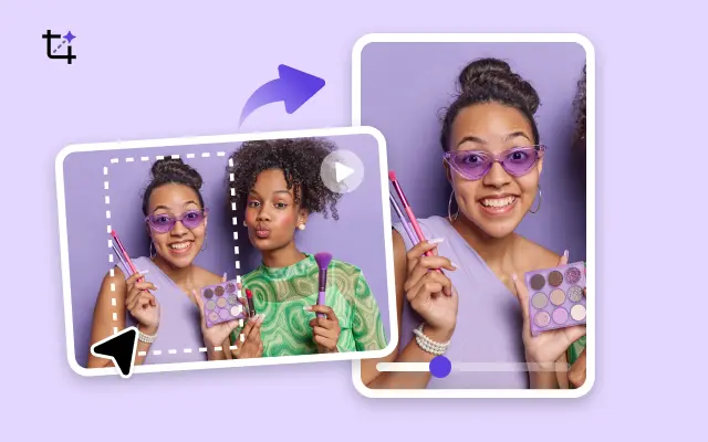
Smart Crop
Crop videos to perfectly fit any platform's aspect ratio.
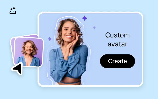
Custom Avatar
Create your own unique digital avatar for a personalized touch.
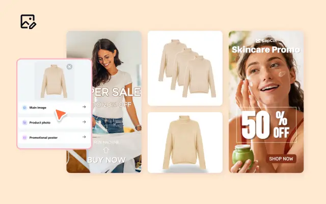
Image Editor
Your go-to tool for creating and editing images with ease.
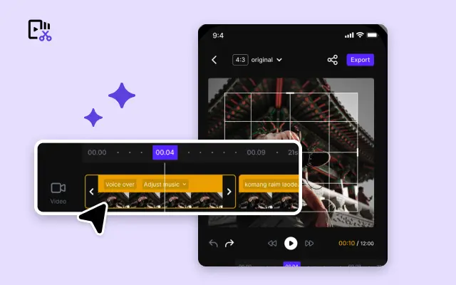
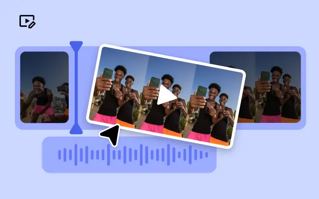
Quick Cut
Speed up video editing by transcribing and editing directly from text.
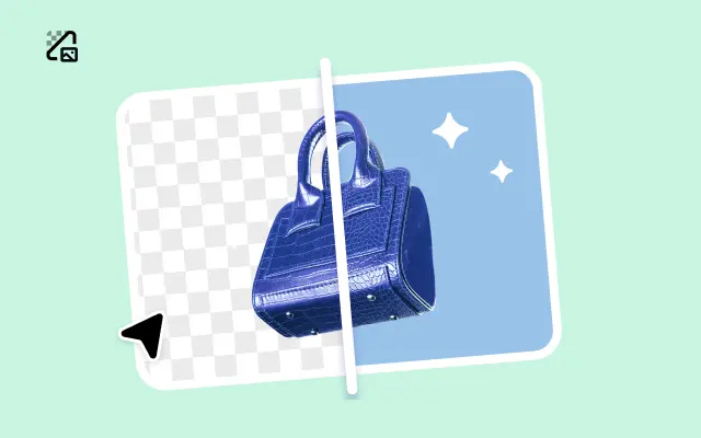
Remove Background
Instantly remove backgrounds from images with one click.
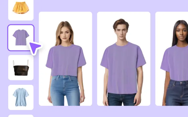
AI Model
Showcase your clothing on AI models for an immersive try-on experience.
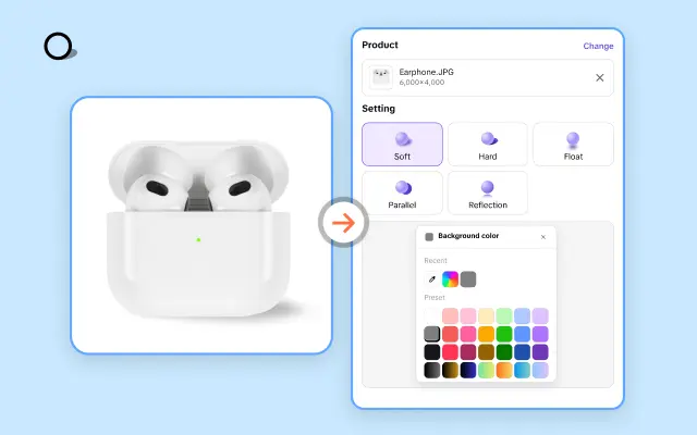
AI Shadows
Add lifelike shadows and lighting to products for enhanced realism.
About Screen Size Template 3.4 Inches
When creating content for a wide range of screens, ensuring perfect proportions and a flawless design can be challenging. For businesses and creators who demand precision, Pippit's Screen Size Template for 3.4-inch displays is the ultimate solution. Whether you're designing visuals for products, interfaces, or multimedia content, this specialized template ensures that your designs look stunning and perform seamlessly on screens of this exact size.
Pippit simplifies the process of creating optimized designs, saving you the time and guesswork often associated with formatting. With the 3.4-inch Screen Size Template, you get precise dimensions tailored for compact displays, making it ideal for smaller devices without compromising clarity or engagement. This ready-to-use template eliminates the complexity of resizing assets, so you can focus on crafting exceptional content that resonates with your audience.
Here’s how Pippit helps: Our editing platform is designed with user-friendly tools and drag-and-drop functionality, enabling even non-experts to achieve professional results. Need to customize elements like colors, fonts, or layouts? No problem—Pippit gives you full creative control while maintaining the technical precision required for 3.4-inch screens. Plus, with instant previews, you can see exactly how your content will appear before publishing, ensuring a perfect fit every time.
Ready to elevate your designs and embrace efficiency? Try Pippit's Screen Size Template for 3.4-inch displays today! It’s quick, it’s customizable, and it’s crafted to bring your creative ideas to life. Sign up now and experience the ease of professional-level screen design. Your next masterpiece is just a few clicks away!


