Sales Up Graph
Boost your sales with ease! Pippit's templates help you craft stunning graphs that showcase growth, impress stakeholders, and highlight your success—no design skills needed.

80 results found for "Sales Up Graph"
Videos
Images
sale up to 50%
sale up to 50%
#protemplateid#protemplatebisnis#fashion#promotion
CTA Template Business Template Sale Off 3D Style Text Only
CTA Template Business Template Sale Off 3D Style Text Only
Business Template, CTA, Sale Off, Promotion, 3D Style, Text Only. Make Better Ads With Our Template Now!
Presents Progress Of Sale Promotion
Presents Progress Of Sale Promotion
Brand Promotion, Video Intro Template, Short Video. Use our template for unbeatable ad videos.
Playful color pets clothing sale ads template
Playful color pets clothing sale ads template
Pets industry, Bright and vivid colors, Cute, Pet clothing, Promotion, Pet essentials promo
sale
sale
#promkt #sale #salepromotion #business #fyp
SALE off
SALE off
#protrend#sale#product#ustemplate#trend
Fashion sale
Fashion sale
#protemplateid #protemplatebisnis #protrend #ootd
Template Promo Sale
Template Promo Sale
#template #discount #sale #shop #protrend
bag sale promotion
bag sale promotion
#promkt#sale#promotion#discount#blackfriday
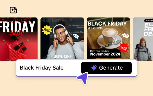
BLACK FRIDAY SALE
BLACK FRIDAY SALE
#promkt#blackfriday#blackfridaysale#marketing#fyp
BLACK FRIDAY SALE
BLACK FRIDAY SALE
#promkt#dynamicposter#blackfriday#sale
Summer Sale Fashion Industry Minimalist Style
Summer Sale Fashion Industry Minimalist Style
Summer sales, minimalist style, clothing, personal care, cosmetics, confident dressing, holiday limited time discounts, use our templates to create unrivaled advertising videos.
big sale special
big sale special
#sale#promotion#capcut#fyp#bigsale
CHRISTMAS SALE
CHRISTMAS SALE
#promkt#christmassale#sale#discountchristmas#fyp
FLASH SALE 9.9
FLASH SALE 9.9
#protemplatebisnis#protemplateid#flashsale#99
Year End Sale
Year End Sale
#proakhirtahun #protemplatefestival #sale #promotion #f
christmas sale
christmas sale
#promkt#newyearsale#shopnow#ordernow
Weekend flash sale
Weekend flash sale
#flashsale#productpromote#sale#marketing#ad
Christmas sale
Christmas sale
#promkt#christmassale#sale#discount
promo : 7.7 big sale
promo : 7.7 big sale
#glow&grow #promo #sale #discount #diskon #promosi #fyp
Fashion Sale Display Tiktok Style
Fashion Sale Display Tiktok Style
Clothing, Fashion, Sale, Tiktok Style , Women's Clothing
Special offer
Special offer
#promkt #blackfriday #blackfridaysale #sale50% #sale
BIG BAG SALE
BIG BAG SALE
#bag#promotion#sale#us#ordernow
SALE
SALE
#sale#specialoffer#discount#protemplate#protrend
Black Friday Sale
Black Friday Sale
#promkt#fashion #ads #sale #promotion
sale discount
sale discount
#promkt #marketing #sale #salepromotion #fy
JEWELRY SUPER SALE
JEWELRY SUPER SALE
#protemplatebisnis #protemplateid #jewelry #jewel
fashion sale
fashion sale
#protemplateid#protemplatebisnis#newcollection
Advertising For Sale Up Food
Advertising For Sale Up Food
Food, Sale Up, Food Template, Red&White, Brand
Black Friday Sale
Black Friday Sale
#trendtemplate#blackfriday#sale#promo#ads
SPECIAL OFFER
SPECIAL OFFER
#lockscreen#heatingup#sale#promotion#ads#discount
HANDBAG SALE
HANDBAG SALE
#capcutforbusiness #blackfriday
Special offers
Special offers
#capcutgala2025#protemplateid#proverticalid#fashion#fyp
Christmas Sale
Christmas Sale
#promkt #marketing #template #christmas #discount
3C Ecommerce Product Display Year End Sale In TikTok Style
3C Ecommerce Product Display Year End Sale In TikTok Style
3C, Product, Sale. Make yours ads stand out now.
CTA General Industry Red And Back Promotion Sale
CTA General Industry Red And Back Promotion Sale
CTA General Industry Red And Back Promotion Sale.
Create Stunning Videos with Our Template Today!
End of Season Sale
End of Season Sale
#capcutsealeague#trendtemplate #sale#promo#ads
Christmas sale
Christmas sale
#promkt #christmassale #salepromotion #sale
Givings Sale
Givings Sale
#promkt#thanksgivingsale#productsale#sale#discount
Black friday sale
Black friday sale
#blackfriday#sale#offer#bedroom #livingroom

All the Smart Tools You Need to Streamline Your Content Creation

Video Editor
A powerful all-in-one video editing tool packed with features.
Sales Poster
Effortlessly create AI-powered promotional posters for your products.
Smart Crop
Crop videos to perfectly fit any platform's aspect ratio.
Custom Avatar
Create your own unique digital avatar for a personalized touch.
Image Editor
Your go-to tool for creating and editing images with ease.
Quick Cut
Speed up video editing by transcribing and editing directly from text.

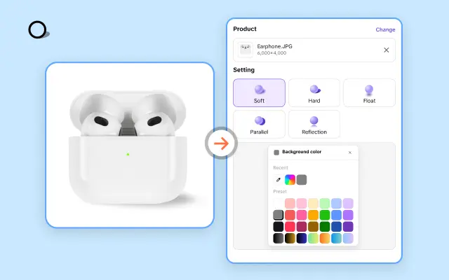
Remove Background
Instantly remove backgrounds from images with one click.
AI Model
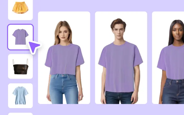
Showcase your clothing on AI models for an immersive try-on experience.
AI Shadows
Add lifelike shadows and lighting to products for enhanced realism.
About Sales Up Graph
Are you ready to turn your data into a sales success story? A well-designed sales up graph can transform dry numbers into a powerful visual narrative, helping you effectively track performance, spot trends, and showcase growth to your team, stakeholders, or clients. With Pippit's expertly crafted sales up graph templates, you'll have all the tools you need to present your data with clarity and impact.
Pippit makes it easier than ever to create professional-grade sales graphs in minutes. Whether you're tracking your revenue growth month over month or highlighting the success of your latest marketing campaign, our templates give you a head start. Simply choose a layout that suits your needs, customize it with your company's unique data, and watch your performance trends come to life. No design or technical expertise needed—thanks to Pippit’s user-friendly platform, you'll be creating high-impact visuals with just a few clicks.
What sets Pippit apart? Our templates are not only visually stunning but also fully editable and responsive. Modify colors, fonts, and even chart types to match your brand identity and presentation goals. Need to integrate other media for an extra layer of context? Pippit allows you to seamlessly add videos, voiceovers, or animations to your sales graphs, making them even more engaging and dynamic.
Ready to inspire action with your data storytelling? Get started by exploring Pippit’s free sales up graph templates today. Elevate your presentations, impress your audience, and take your business communication to the next level. Sign up on Pippit now and create your first customized sales graph in minutes—you'll wonder how you ever managed without it!


