O Templates With Phones
Create scroll-stopping designs with Pippit’s templates. Perfectly optimized for phones, customize content that looks amazing on any screen—quick, easy, and professional!
80 results found for "O Templates With Phones"
Videos
Images
new iphone model
new iphone model
#iphone#sidracuts#trendiphone#trending#iphonetemplate
Mobile Phone & Computer Daily Sale
Mobile Phone & Computer Daily Sale
Vaporwave Style, Pink, Desktop Computers, Laptops, Tablets, PDAs, Mobile Phones, Product Display.Create engaging ads quickly and easily.
hiệu ứng ảnh đẹp
hiệu ứng ảnh đẹp
#freepro
Sports Industry - Minimalist Aesthetic Outdoor Sports Templates
Sports Industry - Minimalist Aesthetic Outdoor Sports Templates
Website UI For Sport Industry Motivation
Summer Music Festivals Social Media Rock Style Business Templates
Summer Music Festivals Social Media Rock Style Business Templates
Summer music festivals, social media, rock style, make a statement with your advertising video.
Business Templates 2024 Recap Business Entertainment Tiktok
Business Templates 2024 Recap Business Entertainment Tiktok
business templates,2024 Recap,media,entertainment,Unveiling the Story of Our Brand·2024,025: Embracing Change for a Better Tomorrow
old to new phone
old to new phone
#tiktoktrend.
Two Phones
Two Phones
#twophones #fyp #trend #newtrend #viral
Digital Accessories Daily Promo-Tiktok Style
Digital Accessories Daily Promo-Tiktok Style
Tiktok Style, Data Cables, Hubs, Mobile Hard Drives, Sales, Product Showcase. Boost Your Video Ads With Our Templates.
my phones at one-
my phones at one-
#blowup#blowup#blowup
new template
new template
#proviral#song#trend#new#fyp
Soccer Theme Sports Industry Templates Promotion
Soccer Theme Sports Industry Templates Promotion
Business Template, Sports Industry, soccer theme open, demand templates. Easily create advertising videos with our customised templates! (You can change the color on the editing page.On the APP: Adjust>Saturation>Color. On PC: Adjustment>Basic>Adjust>Color.)
Business Template, Sports Industry, soccer theme open-demand templates.
Business Template, Sports Industry, soccer theme open-demand templates.
Business Template, Sports Industry, soccer theme open-demand templates. Make your ads more engaging with our video template.
Phones Sale template
Phones Sale template
#phone#shop#sale
Digital Products Mobile Showcase Light Tone Electronics
Digital Products Mobile Showcase Light Tone Electronics
Digital products, cell phone displays, light tones, high end, tech, use our templates to create unparalleled advertising videos.
Laptop Using Display
Laptop Using Display
Mobile Phones, Pocket Computers Realistic Style, Big Sale. Create engaging ads quickly and easily.
Colorful Style Internal Meeting Promotion Template for Enterprises
Colorful Style Internal Meeting Promotion Template for Enterprises
Cool and stylish templates for promoting internal corporate meetings, providing suggestions for your advertising production
New 2025 Templates
New 2025 Templates
#Foryou #lifestyle #tiktok #capcutpro #template2025
Fashion Trend New Products New Hip Cool Business Templates
Fashion Trend New Products New Hip Cool Business Templates
Fashion Trend,New Products,New Hip Cool,Create ads with our template conversion.
try this!!
try this!!
#fyp #trend
Tiktok for Fashion Templates
Tiktok for Fashion Templates
#cinema #aestethic #cinematic #fashion #fyp
Phones
Phones
#karrill #trend #phone #newtrend
cell phone case
cell phone case
#protemplatetrends #cellphonecase #marketing
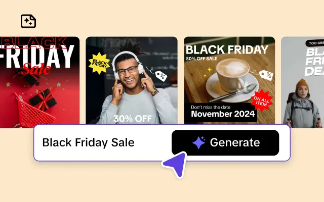
3C Industry Black Friday Ads Templates
3C Industry Black Friday Ads Templates
Black Friday, Headphone, 3C Industry. Make better ads with our template now!
G_CLAS💯📈
G_CLAS💯📈
#trend #vairal #car #caredit #cartemplate
Intro Logo Templates for High-tech Company Promotional Videos
Intro Logo Templates for High-tech Company Promotional Videos
PNG Images, Intro, Logo Templates, High-tech, Company Promotional. Boost your ad campaign with our easy-to-use video template.
Digital Appliances, Small Appliances, Minimalist, Business Templates.
Digital Appliances, Small Appliances, Minimalist, Business Templates.
Digital Appliances, Small Appliances, Minimalist, Business Templates. Make your ads more engaging with our video template.
Summer Staycation
Summer Staycation
#azure
Lots of phones meme
Lots of phones meme
Guy using lots of cell phones #meme #threads #taskforce
Ghép hiệu ứng 159
Ghép hiệu ứng 159
#ghepdienthoai#hieuungdep#nhachay#quangngan68
PORSCHE💀📈
PORSCHE💀📈
#trend #vairal #car #caredit #vairaltemplate
YOUR PHOTOO 🤍✨
YOUR PHOTOO 🤍✨
#collagephoto #usemytemplates #photoaestetic
jabri-70
jabri-70
#قالب جميل للتيك توك
Business Templates 2024 Recap Business Entertainment Tiktok
Business Templates 2024 Recap Business Entertainment Tiktok
business templates,2024 Recap,media,entertainment,Unveiling the Story of Our Brand·2024,025: Embracing Change for a Better Tomorrow
iphone frame
iphone frame
#iphoneframe #changescreen
Laptop Promotion Ad Template
Laptop Promotion Ad Template
Mobile Phones, Pocket Computers, Electronic product, Realistic Style. Save time and money on ad video creation.
🌕 LONDON VIBES 🌕
🌕 LONDON VIBES 🌕
#trend #fyp #viralcapcut🔥 #london #trendtiktok
Trend template
Trend template
#lifemoments #fyp #trend #viral #foryou
me no service
me no service
#proviral#foryou#trend#travel#healing
Eid Trend ❤️
Eid Trend ❤️
Eid Mubarak ❤️😍😘❤️🩹🦋#s_rtemplates #capcut 🔥🔥

All the Smart Tools You Need to Streamline Your Content Creation
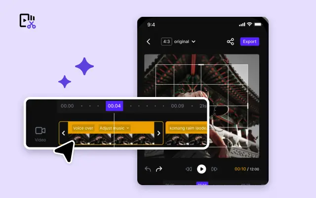
Video Editor
A powerful all-in-one video editing tool packed with features.
Sales Poster
Effortlessly create AI-powered promotional posters for your products.
Smart Crop
Crop videos to perfectly fit any platform's aspect ratio.
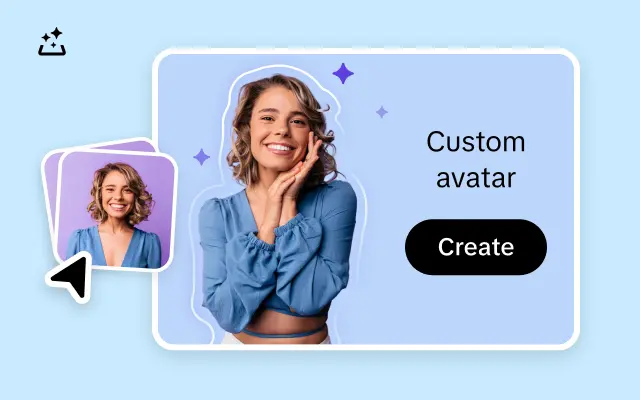
Custom Avatar
Create your own unique digital avatar for a personalized touch.
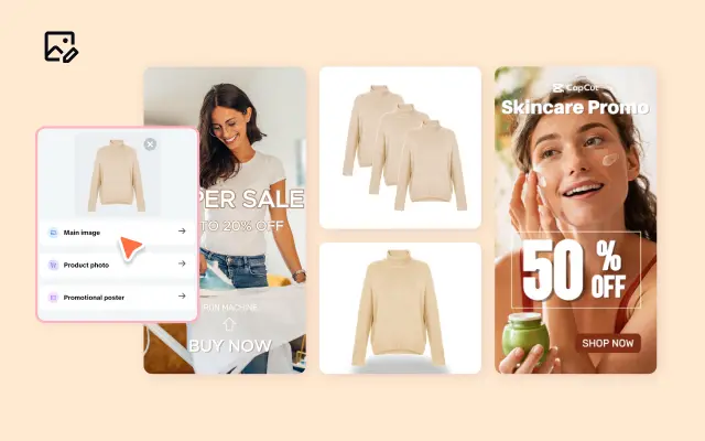
Image Editor
Your go-to tool for creating and editing images with ease.
Quick Cut
Speed up video editing by transcribing and editing directly from text.
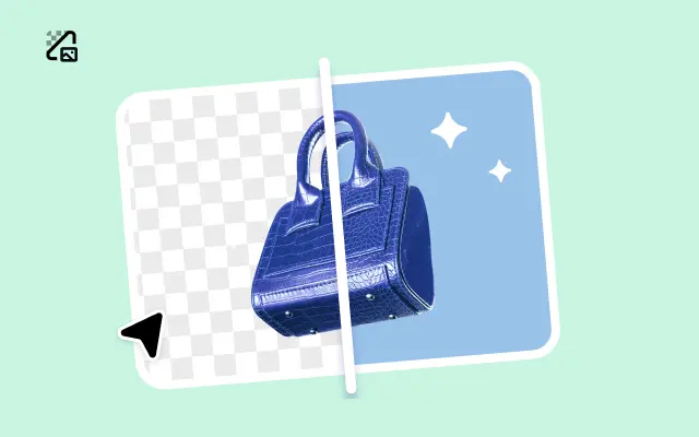
Remove Background
Instantly remove backgrounds from images with one click.
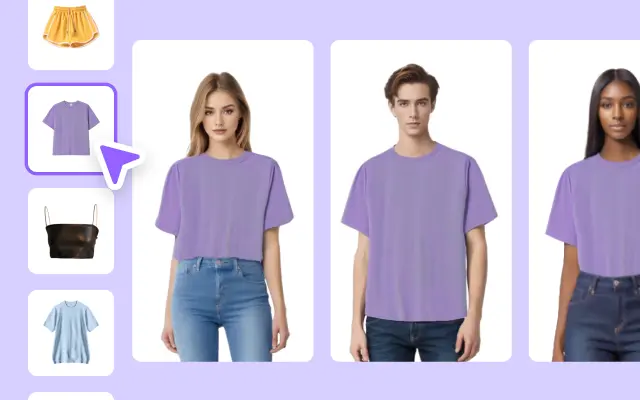
AI Model
Showcase your clothing on AI models for an immersive try-on experience.
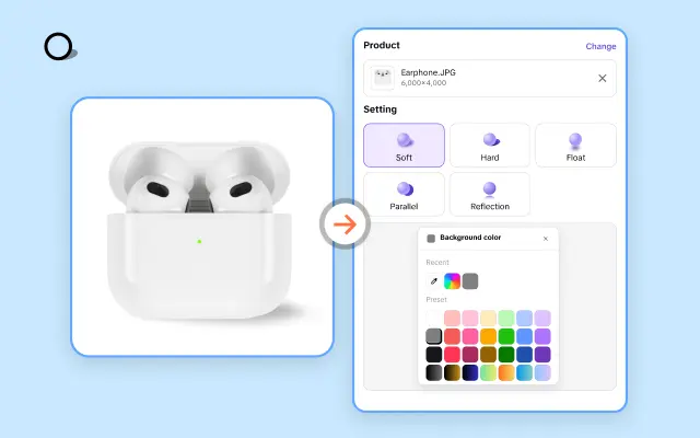
AI Shadows
Add lifelike shadows and lighting to products for enhanced realism.
About O Templates With Phones
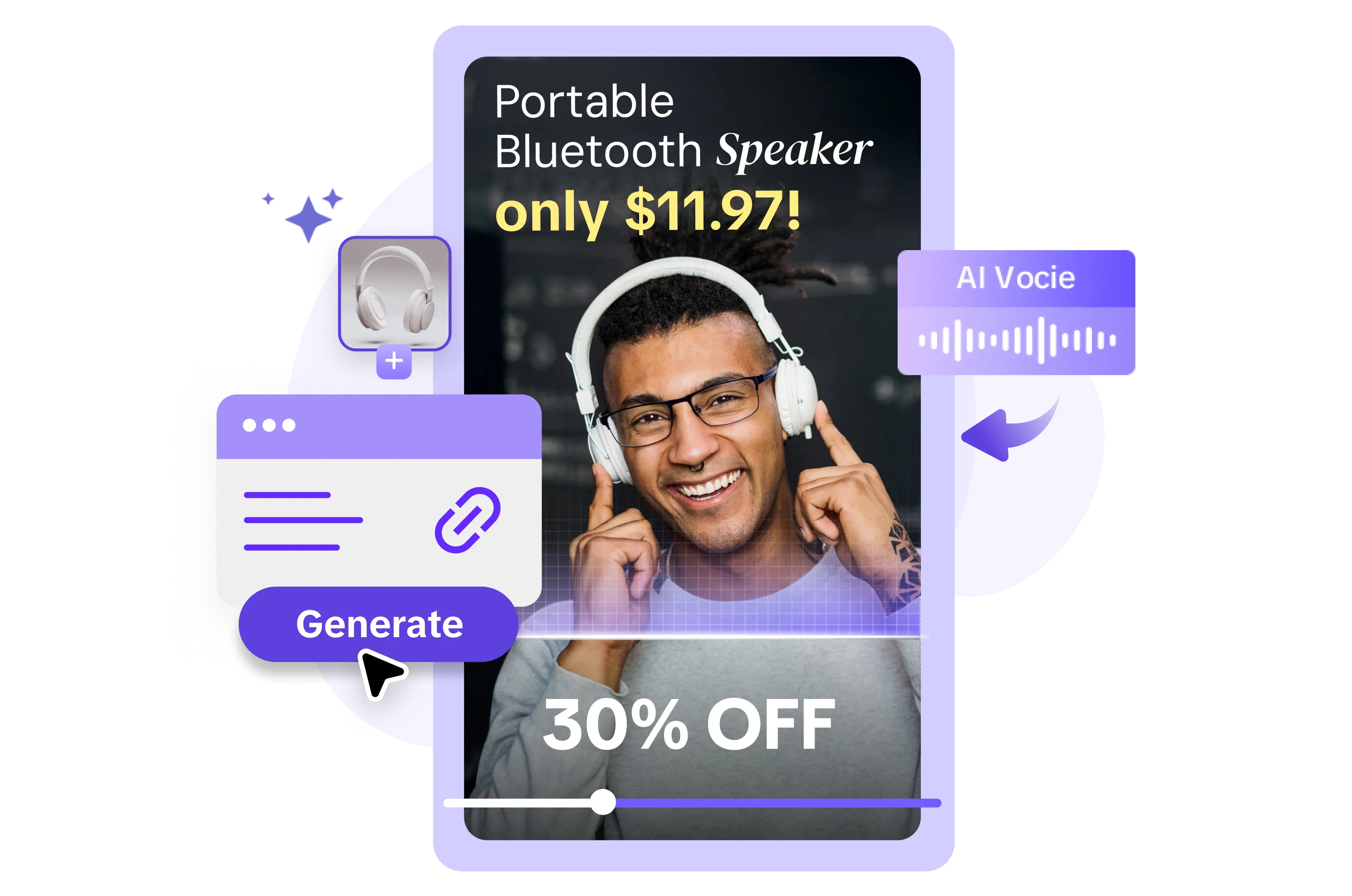
Struggling to make your business shine in today’s competitive digital world? It’s no secret that engaging your audience starts with visuals that pop—especially on mobile devices. Smartphones are where your brand’s story often begins, so why not craft it confidently and with style? Pippit’s O templates designed for phones are here to transform your approach to e-commerce visuals, taking your multimedia content to a whole new level.
With Pippit’s O templates optimized for mobile screens, creating sleek and responsive content has never been easier. Whether you’re introducing a product line, launching a sale, or sharing your team’s story, these templates keep your viewers engaged with polished, mobile-friendly layouts. The designs are crafted specifically for modern smartphones, ensuring every detail—from images to calls-to-action—fits seamlessly on small screens. Say goodbye to stretched visuals and crowded text. Pippit’s mobile-first approach means your audience sees your brand exactly how you want them to—clean, clear, and bold.
But it doesn’t stop there. Our O templates are not just visually stunning; they’re functional too. With Pippit’s user-friendly design tools, you can customize colors, fonts, and animations in minutes—no design skills required! Want to add a personal touch? Easily upload your photos and videos, or edit ready-made stock footage available through the platform. Need to drive more conversions? Integrate clickable links or showcase exclusive offers with attention-grabbing designs that compel action. Pippit ensures your brand stands tall amidst the endless scroll.
Ready to give your visuals the mobile-first advantage? Start exploring Pippit’s O templates for phones today! No matter where your audience is, your message will be clear, professional, and unforgettable. Don’t wait—sign up and begin creating tailored content that’ll connect, captivate, and convert. Pippit makes mobile marketing effortless.


