Laptop Mobile
Create stunning Laptop Mobile templates effortlessly with Pippit, customizing designs to fit your brand. Enhance product appeal and boost e-commerce sales through intuitive editing tools.
80 results found for "Laptop Mobile"
Videos
Images
Laptop and HP nih
Laptop and HP nih
Yuk di ekspor#estetik#fyp#hp#trend
Digital Products Usual Promotion
Digital Products Usual Promotion
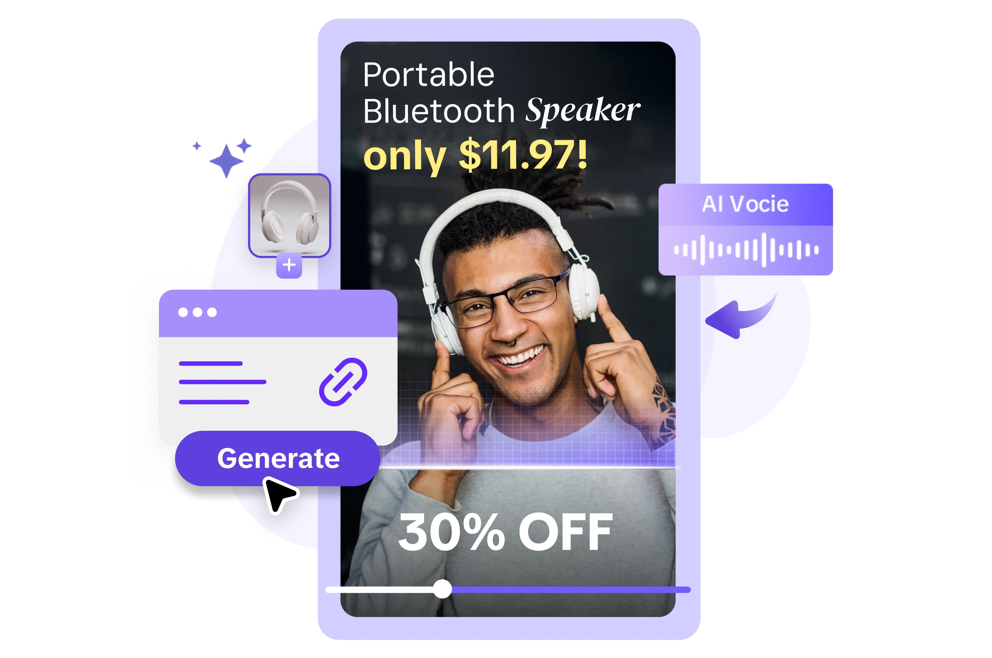
Mobile Phone, Computer, Promotion. Boost your video ads with our template.
Minimalist Modern Animation Sale
Minimalist Modern Animation Sale
Modern, Black, White, Simple, Fashion, Minimalist. Mobile Phone & Computer Using. Make a statement with your ad videos.
Digital Devices Display
Digital Devices Display
Contrast Colored Style, Mobile Phone, Computer. Elevate your ads with our professional-grade video template.
CINEMATIC PC
CINEMATIC PC
#templetcapcut #pcgaming #cinematicestetik #kamaraestet
Pc setup
Pc setup
#DJEIPerdon
laptopandphone<3
laptopandphone<3
#trending🔥#usenow✨❤️#like&follow❤️
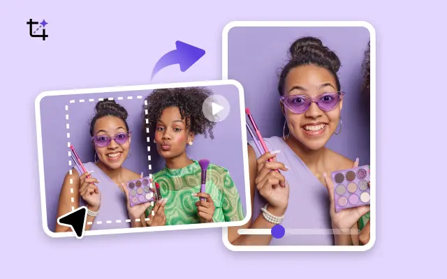
Multi-Person Presentation of Digital Products
Multi-Person Presentation of Digital Products
Mobile Phone, Computer, Minimalist Style. Make an impact with your ads using our easy-to-use video template.
Laptop promotion
Laptop promotion
#laptop#promotion#tecnology#ccforbusiness
Electronic Devices Promotion
Electronic Devices Promotion
Mobile Phone, Computer, Contrast Colored Style. Boost your ad campaign with our easy-to-use video template.
Computer, internet,
Computer, internet,
What if Alastor joins the V’s?
Mobile Phone Multifunctional Display
Mobile Phone Multifunctional Display
Tech Style, Digital Appliance, Product Display. Make better ads with our template now!
MLBB Profile
MLBB Profile
#mobilelegends#beatmaster#trending#dvorayeditz
Laptop Using Display
Laptop Using Display
Mobile Phones, Pocket Computers Realistic Style, Big Sale. Create engaging ads quickly and easily.
Mobile Phone & Computer Summer Sale
Mobile Phone & Computer Summer Sale
Street Style, Black, Yellow, Promo, Product Display. Improve your ad video quality today.
laptop promo
laptop promo
#protemplatebisnis#protemplateid#gadget#ads
Product Review
Product Review
Laptop, in video #yt_templates
programmer intro ²⁷
programmer intro ²⁷
#intro#opening#logo
trend foto PC
trend foto PC
#trenfotopc#trend#fyp
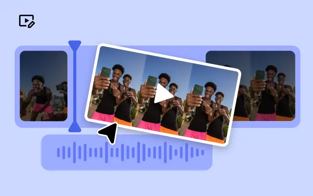
Multi-person Using A Mobile Phone
Multi-person Using A Mobile Phone
Contrast Color Style, Blue, Digital Industry, Product display.Simplify your ad video creation process.
Phone Case Product Display Text To Speech TikTok Style
Phone Case Product Display Text To Speech TikTok Style
Phone, multi gallery, accessories, Promotion, mobile phone
Mobile Phone & Computer Daily Sale
Mobile Phone & Computer Daily Sale
Vaporwave Style, Pink, Desktop Computers, Laptops, Tablets, PDAs, Mobile Phones, Product Display.Create engaging ads quickly and easily.
Electronic Products
Electronic Products
Minimalist Style, Mobile Phone, Computer. Make better ads with our template now!
Laptop Interface
Laptop Interface
#laptop #interface #vlog
Electronic Devices Display
Electronic Devices Display
Mobile Phone, Computer, Tech Style. Make your ads more engaging with our video template.
phone screen
phone screen
#screen
Your mobile type
Your mobile type
#yhia_yassen
#fyp
#trend
#foryou
Laptop Promotion Ad Template
Laptop Promotion Ad Template
Mobile Phones, Pocket Computers, Electronic product, Realistic Style. Save time and money on ad video creation.
Digital Products Display
Digital Products Display
Multi-Person Presentation, Mobile Phone, Computer, Minimalist Style. Improve your ad video quality today.
Trend MànHình Laptop
Trend MànHình Laptop
Mẫu Hot #top #xh #tk #ghep #trendmoi
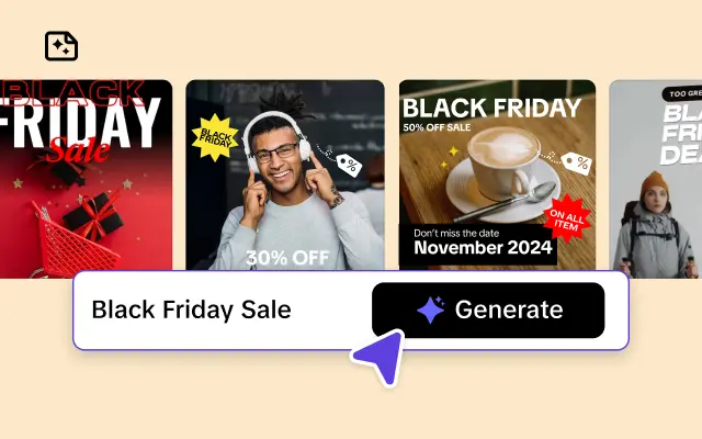
Modern Mobile Phone Sale
Modern Mobile Phone Sale
Green, Black,Modern, Simple, Mobile Phone & Computer. Summer Sale. Street Style. Create stunning ad videos with ease
PCsetup 8 video 16:9
PCsetup 8 video 16:9
#pcgaming#pcsetup#16.9
Creative Advertising For Mobile Phone Accessories
Creative Advertising For Mobile Phone Accessories
Creative Advertising For Mobile Phone Accessories, electronic products, Earphone, Product Display. Transform your ad game with our video template!
Digital Products Mobile Showcase Light Tone Electronics
Digital Products Mobile Showcase Light Tone Electronics
Digital products, cell phone displays, light tones, high end, tech, use our templates to create unparalleled advertising videos.
Mobile and Computer Display
Mobile and Computer Display
Electronic, Creative, Purple, Minimalist.
Impress your audience with stunning ad videos.
Electronic Products Usual Promotion
Electronic Products Usual Promotion
Contrast Colored Style, Mobile Phone, Computer. Create eye-catching ad videos with our customizable template.
Laptop and Manga
Laptop and Manga
#laptopframe #manga #overlay #laptop
Produc display
Produc display
#fyp#trend#laptop
Mobile Phone Using Display
Mobile Phone Using Display
Technology, Mobile Phone, Product Display. Want to make ad videos that get results? Try our template today!
Mobile Phone Promotion
Mobile Phone Promotion
Stylish, Cool, Blue, Black, Electronic product. Get noticed with high-quality ad videos.

All the Smart Tools You Need to Streamline Your Content Creation
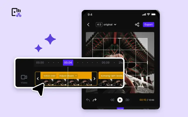
Video Editor
A powerful all-in-one video editing tool packed with features.
Sales Poster
Effortlessly create AI-powered promotional posters for your products.
Smart Crop
Crop videos to perfectly fit any platform's aspect ratio.
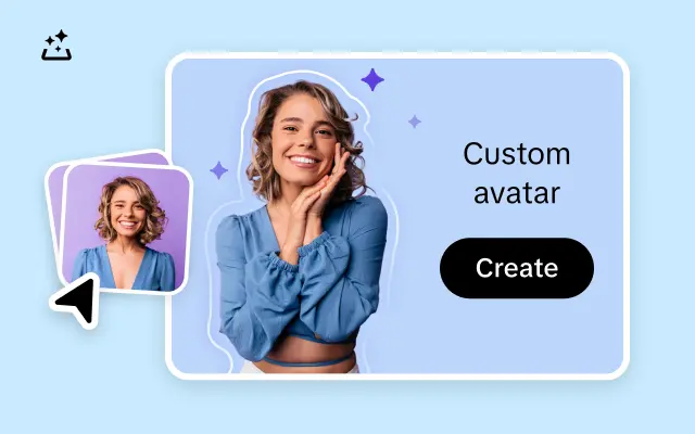
Custom Avatar
Create your own unique digital avatar for a personalized touch.
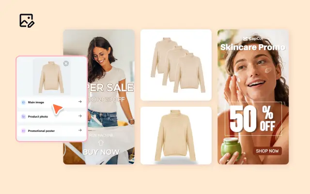
Image Editor
Your go-to tool for creating and editing images with ease.
Quick Cut
Speed up video editing by transcribing and editing directly from text.
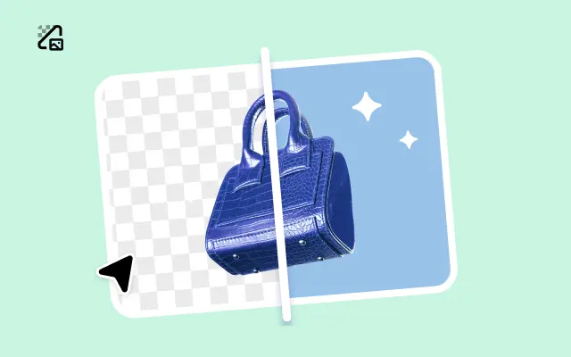
Remove Background
Instantly remove backgrounds from images with one click.
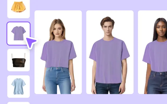
AI Model
Showcase your clothing on AI models for an immersive try-on experience.
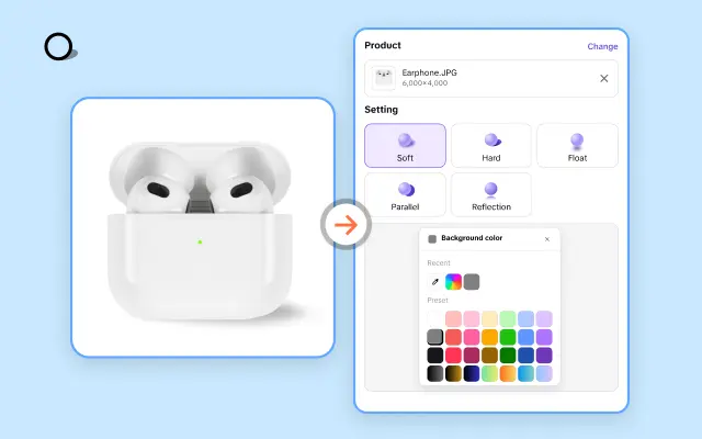
AI Shadows
Add lifelike shadows and lighting to products for enhanced realism.
About Laptop Mobile
In today's fast-paced digital landscape, creating engaging video content that looks great on both laptops and mobile devices is essential for any business aiming to capture a wider audience. However, designing videos that seamlessly adapt to multiple screen sizes can be challenging, time-consuming, and often requires advanced technical skills. Many businesses struggle with inconsistent video quality and poor user experience, which can hinder their marketing effectiveness and brand reputation.
Pippit offers a comprehensive solution specifically designed to simplify this process with its Laptop Mobile video templates. These templates come optimized for responsive viewing, ensuring your multimedia content maintains its professional edge whether viewed on a laptop or a mobile device. By leveraging Pippit's intuitive platform, businesses can effortlessly create, edit, and publish videos that are perfectly tailored to every screen size without the need for complex coding or multiple versions.
With Pippit's Laptop Mobile templates, you gain access to expertly crafted video layouts that adapt fluidly to different display dimensions, retain clarity, and enhance viewer engagement. Key features include drag-and-drop editing, customizable branding elements, and seamless integration with popular e-commerce platforms, empowering you to produce polished promotional videos that drive conversions. This not only streamlines your content creation workflow but also ensures your message reaches customers consistently and professionally across all devices.
Take the guesswork out of multi-device video marketing today. Visit Pippit to explore our versatile Laptop Mobile templates and start crafting videos that resonate with your audience no matter where they watch. Sign up now to unlock a new level of efficiency and quality in your multimedia content strategy and stay ahead in the competitive e-commerce environment.


