Intro Blog Whole Screen Size
Make a bold first impression with intro blog templates optimized for full-screen sizing. Customize effortlessly to captivate readers and spotlight your content instantly.
80 results found for "Intro Blog Whole Screen Size"
Videos
Images
Opening / Intro Vlog
Opening / Intro Vlog
#lifegrowth#openingvlog#introvlog#vlog#opening
opening vlog 16:9
opening vlog 16:9
#minivlog#introducing#makeitviral#trends#dailyvlog
intro vlog
intro vlog
#trendtemplate#openingvlog
Intro YouTube
Intro YouTube
#semuabisa#capcuthq#vlog#sipalingvertikal
INTRO YOUTUBE VLOG
INTRO YOUTUBE VLOG
#welcometomyvlog #introvlog #introvideovlog #intro
Mini Vlog Opening In
Mini Vlog Opening In
#CapCutTopCreator#opening#intro#vlog#video
intro vlog
intro vlog
#vlog #intro #trend #fyp
intro vlog
intro vlog
#vlog #introvlog #templateviral #fyp🔥
Travel Vlog
Travel Vlog
#capcuthq#travelvlog#intro
Opening / Intro Vlog
Opening / Intro Vlog
#everydayvlog #openingvlog#intro#introvlog#opening
Daily intro
Daily intro
#yt_templates
#vlog
#intro
intro vlog
intro vlog
#introvlog#4video1foto#viral#fyp
intro vlog 9:16
intro vlog 9:16
#vlogestetik#introaesthetic#adayinmylife#dailyvlog
travel intro
travel intro
#yt_templates#travel#intro
Daily vlog - Intro
Daily vlog - Intro
#yt_templates#dailyvlog#vlog#intro
daily vlog intro
daily vlog intro
#openingvlog#introvlog#tugas#trending#us#fyp
opening daily vlog
opening daily vlog
#introvideovlog #openingvideos
opening vlog
opening vlog
#introvideovlog #openingvideos
Opening cinematic
Opening cinematic
#opening #intro #cinematic #minivlog #travel
opening vlog
opening vlog
#openingvlog#opening#vlog#vlogestetik#videoopening
Daily Vlog Intro
Daily Vlog Intro
#yt_templates#dailyvlog
Intro / Opening Vlog
Intro / Opening Vlog
#everydayvlog#opening#intro#introvlog#openingvlog
opening vlog
opening vlog
#introvideovlog #openingvideos
Opening Vlog
Opening Vlog
#opening#openingvlog#intro#introvlog#vlog
Intro Daily Vlog
Intro Daily Vlog
#yt_templates#intro#dailyvlog#youtube#aesthetic
intro vlog 9:16 vers
intro vlog 9:16 vers
#minivlog #introducing #introvlog #makeitviral #trends
Travel Vlog Intro
Travel Vlog Intro
#yt_templates #travel #intro #travelvlog
welcome to my vlog
welcome to my vlog
#minivlog#aesthetic#viral#fyp#trend
welcome to my vlog
welcome to my vlog
#vlog#mimivlog#protemplate#trend
intro video
intro video
#fyp#viral#openingvlog#introvlog#foryou
Opening Vlog
Opening Vlog
#opening#vlog#openingvlog#cuteopening#entrance
Opening vlog 9:16
Opening vlog 9:16
#vlog#intro #opening#viral#fyp#minivlog
Intro aesthetic
Intro aesthetic
#fyp#intro#trend#vlog
Daily Intro
Daily Intro
#yt_templates #daily #vlog #youtube #fyp
Travel Vlog Intro
Travel Vlog Intro
#capcuthq#semuabisa#intro
Opening / Intro Vlog
Opening / Intro Vlog
#everydayvlog#opening#openingvlog#introvlog#intro#vlog
intro vlog landscape
intro vlog landscape
intro landscape #intro#introvideo#vlog#landscape
Vlog Opening
Vlog Opening
pick 1 video and get a beautiful opening of your #vlog
intro vlog 9:16
intro vlog 9:16
#openingvlog #intro #opening #adayinmylife #introvlog
opening vlog potret
opening vlog potret
#CapCutSEALeague#viral#trending#openingvlog#potret

All the Smart Tools You Need to Streamline Your Content Creation
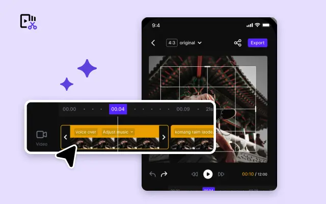
Video Editor
A powerful all-in-one video editing tool packed with features.
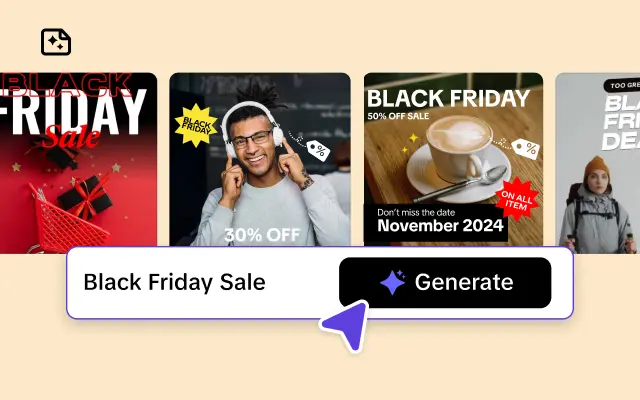
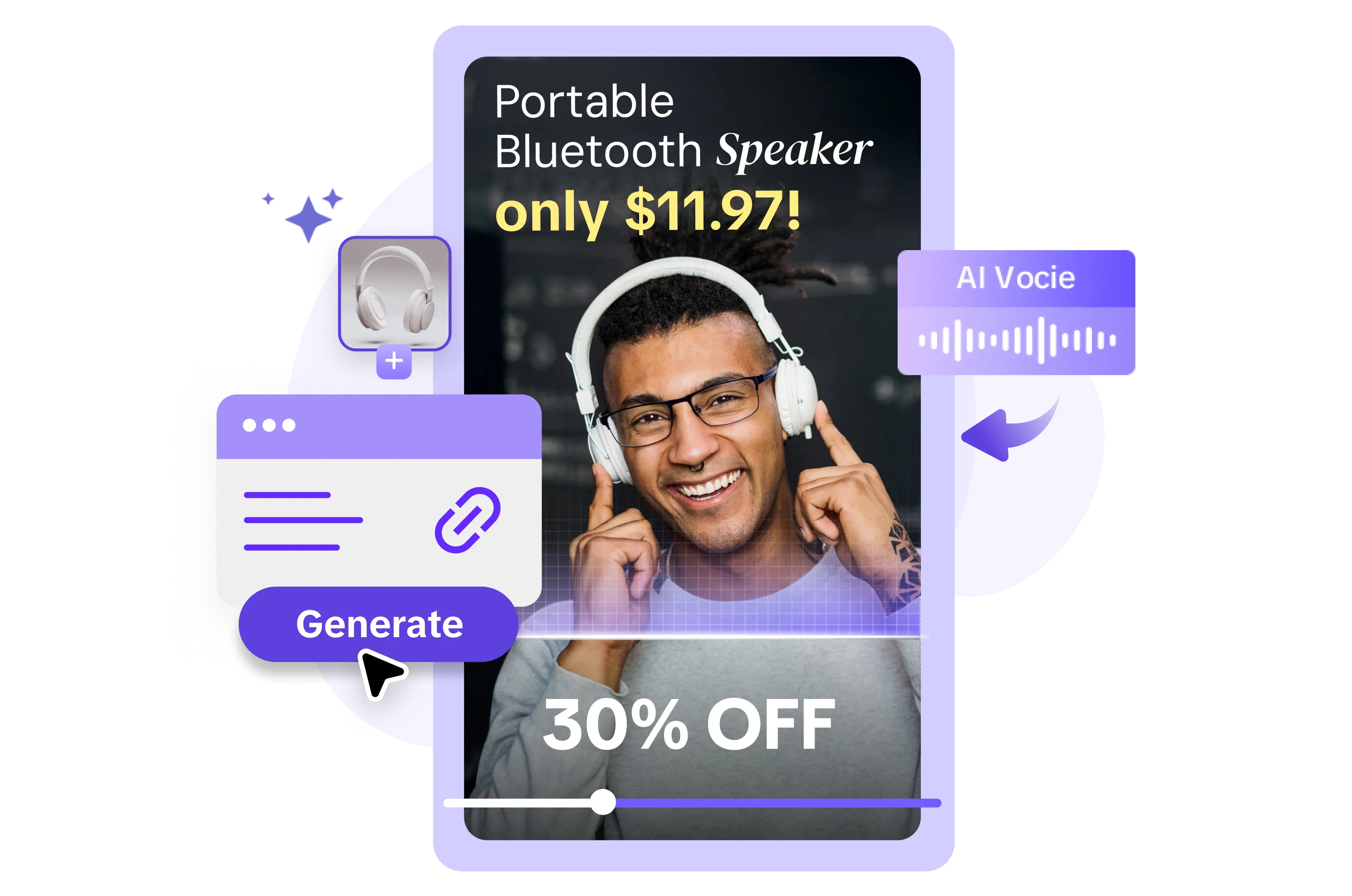
Sales Poster
Effortlessly create AI-powered promotional posters for your products.
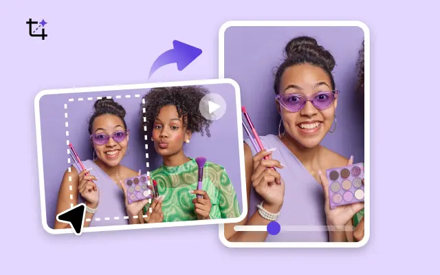
Smart Crop
Crop videos to perfectly fit any platform's aspect ratio.
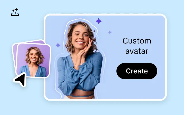
Custom Avatar
Create your own unique digital avatar for a personalized touch.
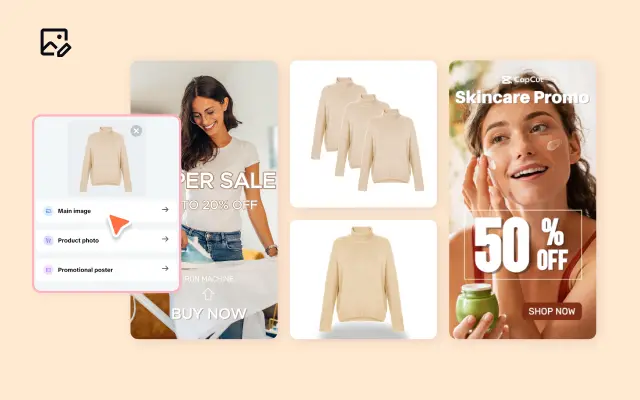
Image Editor
Your go-to tool for creating and editing images with ease.
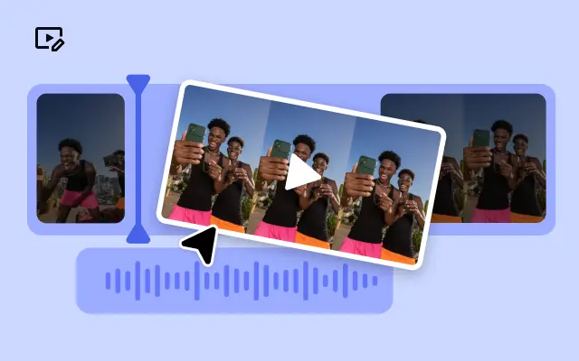
Quick Cut
Speed up video editing by transcribing and editing directly from text.
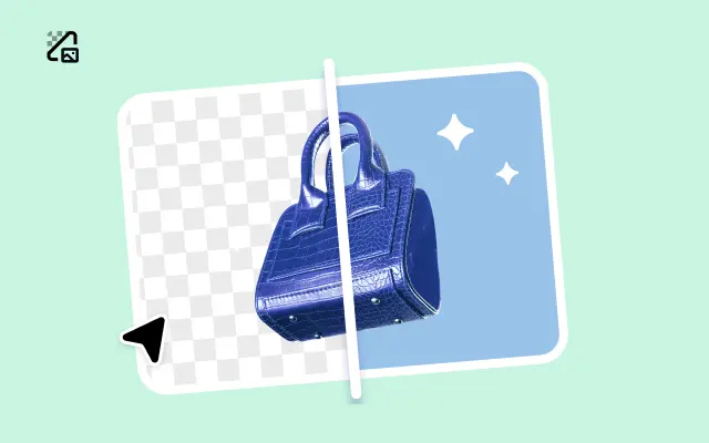
Remove Background
Instantly remove backgrounds from images with one click.
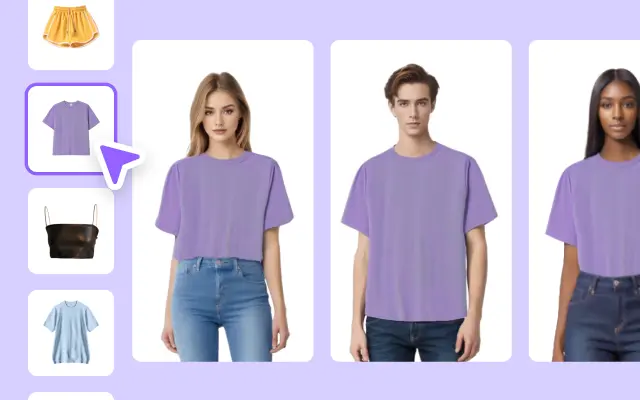
AI Model
Showcase your clothing on AI models for an immersive try-on experience.
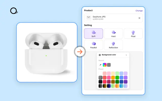
AI Shadows
Add lifelike shadows and lighting to products for enhanced realism.
About Intro Blog Whole Screen Size
Imagine capturing your audience's attention the moment they land on your site – no distractions, just the perfect introduction to your content. With Pippit's **Intro Blog Whole Screen Size templates**, you can create stunning, full-screen introductions that showcase your brand and story in the most immersive way possible. Whether you're launching a new product line, building excitement for your latest blog post, or sharing your company's mission, these templates ensure your message takes center stage.
Gone are the days of generic banners or cluttered homepage designs. Pippit empowers you to go bold with full-screen visuals, high-impact headlines, and compelling calls-to-action that invite your visitors to dive deeper. Not a design expert? No worries. Pippit's intuitive editing platform features drag-and-drop tools and ready-made elements that make creating your intro seamless – no coding skills required. You can upload your own images or choose from our expansive media library to craft a look that perfectly aligns with your brand's identity.
The benefits don’t stop at aesthetics. By using Pippit’s whole-screen intro templates, you’ll enhance readability and focus, ensuring your key message isn’t lost in the noise. Plus, these templates are fully responsive – they automatically adjust to look incredible on any screen size, from desktop to mobile. That means your audience enjoys the same captivating experience, no matter how they access your site.
Ready to leave a lasting impression? Start building your **whole-screen intro blog** with Pippit today. Sign up for free and explore customizable templates that transform your website into a storytelling powerhouse. Don’t just tell your story – make it impossible to miss.


