Decline Graph
Visualize your sales trends with decline graph templates that simplify data interpretation. Customize effortlessly to spot declines early and strategize for better business outcomes.

80 results found for "Decline Graph"
Videos
Images
Memories Calling
Memories Calling
#memories #friends #family #bestie #relationship
Calling memories
Calling memories
#Trending #trend #fyp #edit #velocity #discord
dropcall
dropcall
#fyp#foryou#trend#viral
TELL 'EM
TELL 'EM
#transition┊#shake┊#graph┊#ree
Locksmith
Locksmith
🔐
Women fashion on Trend in TikTok Style
Women fashion on Trend in TikTok Style
This template create for women fashion on trend promotion, full color, and TikTok style. Boost your ad campaign with easy-yo-use template. Try it Now! #women #fashion #clothing #promotion #tiktoktrending🔥
Your Favorite Memory
Your Favorite Memory
Memories 💭 #fyp #memories #nostalgia #sad #viral
Memories calling new
Memories calling new
#Discord #fyp #trend #viral #foryou
Memories callin
Memories callin
#Foryou #viral #trend #fyp #trend
Android ringtone
Android ringtone
thought this would be a goofy first template :))
5% TINT
5% TINT
w/filter┊#beat┊#transition┊#graph┊#shake┊#hotaudio┊#ree
pov: your function
pov: your function
#pov #povtrend #vlog #dailyvlog #protemplates
Virtual Reality Guest Ads in TikTok Style
Virtual Reality Guest Ads in TikTok Style
This template create for virtual reality guest promotion, neon color, and TikTok style. Boost your ad campaign with easy-yo-use template. Try it Now! #virtualreality #game #promotion #tiktokktrend #glitch
Women Fashion Promotion in TikTok Style
Women Fashion Promotion in TikTok Style
This template create for women fashion promotion, full color, and TikTok style. Boost your ad campaign with easy-yo-use template. Try it Now!#women #fashion #promotion #trend #tiktokktrend
phone call interface
phone call interface
#phone #phonecall #interface #trending🔥
Low battery Bae Call
Low battery Bae Call
#iphonefilter #photosaesthetic #new #fyp #trending #pic
Iphone ringtone
Iphone ringtone
#protemplates #protemplateviral #girlfriendsday2024
Anthophile [n] 💐💐
Anthophile [n] 💐💐
#aesthetic #vlog #anthophile #dallam
.
.
#fyp #discord #viral
Gods creation>>>
Gods creation>>>
#god #nature
memories remain 🦋
memories remain 🦋
#photodump #photo #memories #vibes #preppy
Memories are calling
Memories are calling
❤️
The phone rings
The phone rings
#trendingtemplete#fypcapcut🔥🔥🔥
the phone rings
the phone rings
#fyp #trend #foryou
golden hour
golden hour
#trendtiktok#goldenhour#googleearth#fyp#foryou
Adventures🍁
Adventures🍁
#travel #foryou #trend #viral
New Collection Women Clothing in TikTok Style
New Collection Women Clothing in TikTok Style
This template create for new collection women clothing promotion, full color, and TikTok style. Boost your ad campaign with easy-yo-use template. Try it Now!#women #newcollection #clothing #trend #tiktoktrending🔥
Best show and cast
Best show and cast
Comfort cast
Ringtone Apt
Ringtone Apt
#protemplates#apt#november#novemberrecap#prohq
Phone call edit
Phone call edit
#edit #trend #phone #fyp #viral
#Yrn
#Yrn
#BeatMaster | #graph | #BP_FAM
pov: my camera roll
pov: my camera roll
#pov #cameraroll #vlog #protemplates #peekaboo
Real life aesthetic
Real life aesthetic
#aestehetic #reallife #photodump #fpy #lifestyle #top
my kind of therapy
my kind of therapy
#protemplatetrends #therapy #sunset #mytherapy #mecore
Ringtone edit pt.2
Ringtone edit pt.2
#edit pt.2
Memories calling
Memories calling
#edit #memories #template
OWN BRAND FREESTYLE
OWN BRAND FREESTYLE
#transition┊#beat┊#tiktoktrend┊#graph┊#ree
Future plans
Future plans
#capcut_edit
camera roll recents
camera roll recents
#lowexposure #lifelately #cameraroll #housemusic
New Style Man Clothing in TikTok Style
New Style Man Clothing in TikTok Style
This template create for new style man clothing promotion, black color, and TikTok style. Boost your ad campaign with easy-yo-use template. Try it Now!#man #fashion #clothing #promotion #tiktokktrend

All the Smart Tools You Need to Streamline Your Content Creation

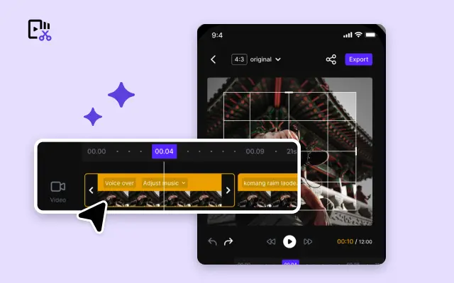
Video Editor
A powerful all-in-one video editing tool packed with features.
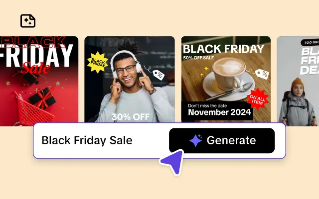
Sales Poster
Effortlessly create AI-powered promotional posters for your products.
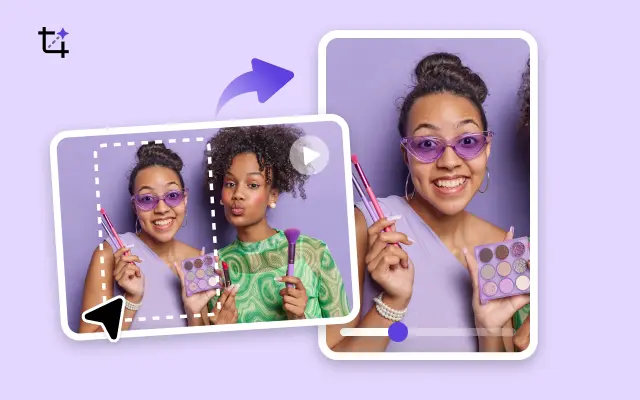
Smart Crop
Crop videos to perfectly fit any platform's aspect ratio.
Custom Avatar
Create your own unique digital avatar for a personalized touch.
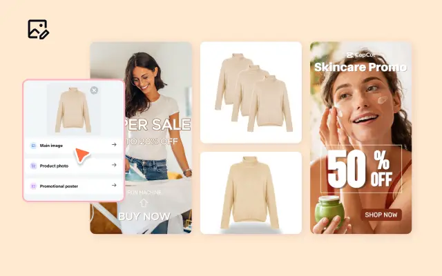
Image Editor
Your go-to tool for creating and editing images with ease.
Quick Cut
Speed up video editing by transcribing and editing directly from text.

Remove Background
Instantly remove backgrounds from images with one click.
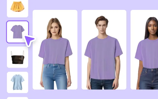
AI Model
Showcase your clothing on AI models for an immersive try-on experience.
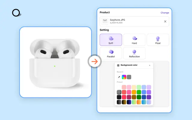
AI Shadows
Add lifelike shadows and lighting to products for enhanced realism.
About Decline Graph
In today's fast-paced business environment, effectively communicating data trends is critical. Whether you're presenting quarterly sales, market analysis, or performance metrics, a clear visual representation of decline trends can make all the difference in how your message is received. However, crafting a professional and visually engaging decline graph often requires design skills and time that many teams simply don't have.
Enter Pippit, your all-in-one e-commerce video editing platform that simplifies the creation of compelling decline graph templates. Pippit offers a rich library of customizable templates specifically designed to highlight downward trends in a clear, impactful manner. With intuitive drag-and-drop tools and preset animations, you can quickly tailor graphs to match your brand’s style without any prior graphic design experience. This not only saves valuable time but also ensures your presentations look polished and credible.
Pippit's decline graph templates come equipped with features that enhance storytelling through data. Choose from a variety of color schemes and formatting options to emphasize critical points, add contextual notes, or animate the gradual decline to capture your audience’s attention. Whether you're showcasing sales decreases, market shifts, or operational challenges, these templates provide a professional framework that helps you deliver complex information with clarity and confidence.
Ready to transform how you present downward trends? Explore Pippit's selection of decline graph templates today and start customizing your data visuals with ease. Sign up now to take advantage of seamless editing, export options, and integration with your existing content strategy. Make your data-driven insights stand out while saving time and effort with Pippit’s powerful platform.


