3 Image Small Screen Template
Effortlessly showcase three stunning images on any small screen. Customize our responsive template to fit your brand and captivate mobile shoppers with ease.
80 results found for "3 Image Small Screen Template"
Videos
Images
16:9 NO MIRROR ASIKK
16:9 NO MIRROR ASIKK
enggak enggak dulu#fyp#jjtipis#trend#zfx117
nhạc xịn quá 😚
nhạc xịn quá 😚
give me your love remix / mẫu ngang #nd #gamelife
soundkece no miror
soundkece no miror
#jjtipis#fyp
TikTok style Clothing Sales Small Screen
TikTok style Clothing Sales Small Screen
TikTok Style, Fashion, Girls,Young, Sale, Clothing,Clothes,Product Display.Get professional-looking ads in minutes.
Women's Clothing Display In Small Screen
Women's Clothing Display In Small Screen
Clothes, Women, Female, Fashion, Vogue, Product Display. Take your ad videos to the next level.
My fav person❤️
My fav person❤️
#bestfriend #bestie #relationship #bff #love
Orange-yellow and White Real Estate Just Listed Promotion Template
Orange-yellow and White Real Estate Just Listed Promotion Template
Real Estate Industry, Orange-yellow and White, Multi-screen Display, Real Estate Just Listed. Boost your Ad Campaign with Our Easy-to-use Video Template!
frame 3 foto
frame 3 foto
#MasterToBe#fyp#fyp#trend#viral#foryou
2 ảnh ngang
2 ảnh ngang
#muathanhxuan đưa em về thanh xuân#thanhxuan
Spring Sale Men's Clothing Display In Small Screen
Spring Sale Men's Clothing Display In Small Screen
Clothes, Men, Male, Fashion, Cool, Product Display. Boostyour video ads with our template.
Food Show Promo In Small Screen
Food Show Promo In Small Screen
TikTok Style, Food Show, Dishes, Coffee, Desserts, Sale, Product Display. Getprofessional-looking ads in minutes.
happy new year
happy new year
#protemplatetrends#monthlyrecap2024#newyear#fyp
Multi 3 Split Screen
Multi 3 Split Screen
#split #fyp #capcut #vlog #trend
3 foto
3 foto
#aestetic#fyp
4 pic 1:1
4 pic 1:1
#foryou#huruka for you
Brush Cosmetics Phone Screen TikTok Style!
Brush Cosmetics Phone Screen TikTok Style!
Show your beauty and brush cosmetics by using this template! #fashiontemplate #fashion #cosmetic #brush #brushmakeup
Branding in Pink & Blue
Branding in Pink & Blue
Split-screen, High-class, Contrast. Create ads that convert with our template.
I love you ❤️
I love you ❤️
❤️love❤️
Men's Clothing Screen Recreation Tiktok Style
Men's Clothing Screen Recreation Tiktok Style
Men's clothing, screen cell phone, tiktok style, product display, want to make ad video that get results? Try our template today!
Nhạc cực cháy
Nhạc cực cháy
Mẫu ngang 3 ảnh
#marcus05#xh
nomiror kece nih
nomiror kece nih
#jjtipis#fyp
happy newyear 2026
happy newyear 2026
#proviral#photo#newtemplate#fyp
heart background
heart background
#protemplate#fyp#trend#viral#foryou #trending#hearts
Valentine's Day Apparel & Accessories Industry-Quick Flash/Split-Screen Display
Valentine's Day Apparel & Accessories Industry-Quick Flash/Split-Screen Display
Clothing, Accessories, Fashion, Check It Now. Try This Template For Your Ads!
Father's Day Man Fashion TikTok Style
Father's Day Man Fashion TikTok Style
This template is created for Father's Day Man Fashion TikTok Style Loading screen. Boost your Ad Campaign with this easy to use template. Try now! #manfashion#fashiontemplate#fathersdaytemplate#fathersdays
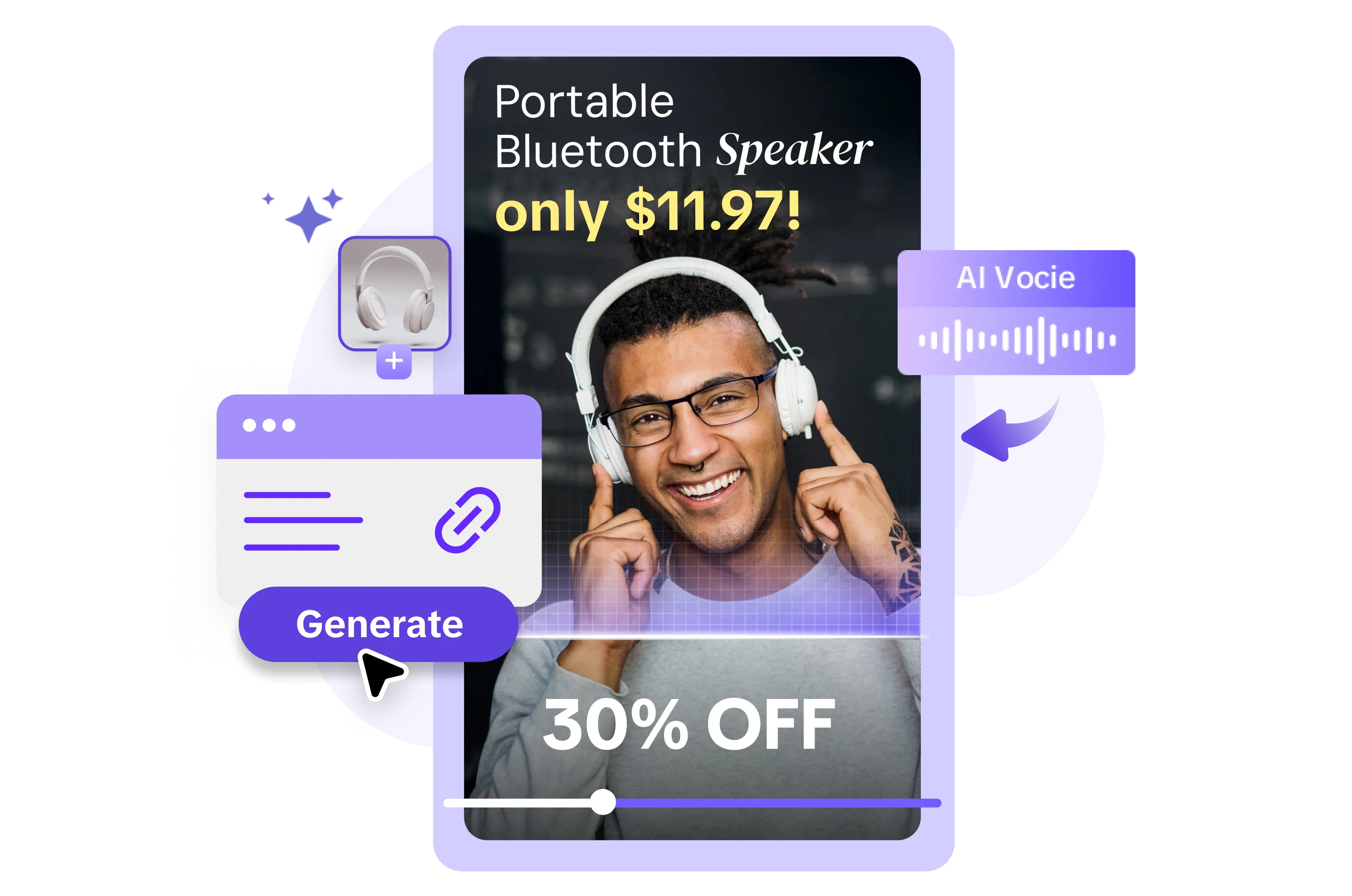
Digital Accessories Screen Display TikTok Style
Digital Accessories Screen Display TikTok Style
This template create for digital accessories, black color, and screen display tiktok style. Boost your ad campaign with easy-yo-use template. Try it Now! #screendisplay #tiktokstyle #headphone #digitalaccessories #black
3grid landscape
3grid landscape
#protemplates#3grid#aesthetic#trend#fyp
3 Photo SoundTrend
3 Photo SoundTrend
#guccigang#3photo#trend#fyp
Spring Sale Men's Clothing Display In Small Screen
Spring Sale Men's Clothing Display In Small Screen
Clothes, Men, Male, Fashion, Cool, Product Display. Boost your video ads with our template.
Food Product Display In Small Screen
Food Product Display In Small Screen
Tiktok Style, Food Show Birthday Cake, Desserts, Product Display.
Try our template
#capcutforbusiness
#food
Movement Patterns
Movement Patterns
#fyp #ttend #cool
Bertiga nih
Bertiga nih
#collab #aoi24 #g7template
☘️Video Creative Brief for St. Patrick's Day
☘️Video Creative Brief for St. Patrick's Day
Clothes, Clothing Display In Small Screen Fashion, Vogue, Product Display. Take your ad videos to the next level.
Beat 3 ảnh ngang
Beat 3 ảnh ngang
Nhạc cuốn vãi ò
#xh#khoa3k#agchn#fyp
3 picc
3 picc
#darkaesthetic# darkfilter#coolboy#fyp#random
Women's Clothing Display In Small Screen
Women's Clothing Display In Small Screen
TikTok Style, Clothes, Women, Female, Fashion, Vogue. Boost your video ads with our template.
45k followers
45k followers
#capcuttemplate
#45k#followers #thankyou #smallcreator
Branding for Clothings
Branding for Clothings
Split-Screen, Spring Collection, High-Class. Make better ads with our template now!
Nail Product Screen Display Tiktok Style
Nail Product Screen Display Tiktok Style
Best Seller, Must Have, Mus Try, Best Sale, Buy One Get One Free, Big Sale, Sale Off, Promo Poster. Create ad videos that convert with our customizable template.
ࣿگل دانه ࣿدانه😻
ࣿگل دانه ࣿدانه😻
#afghan #afghanistan #fypcapcut🔥🔥
#pjr_maroo #افغان

All the Smart Tools You Need to Streamline Your Content Creation
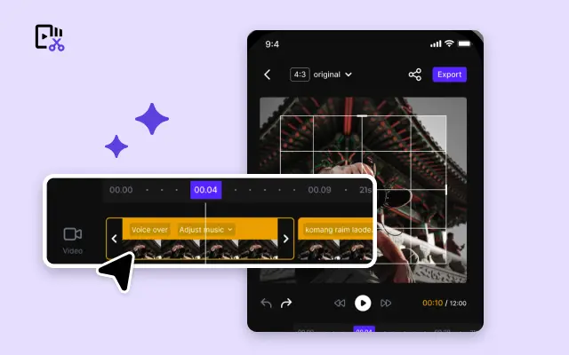
Video Editor
A powerful all-in-one video editing tool packed with features.
Sales Poster
Effortlessly create AI-powered promotional posters for your products.
Smart Crop
Crop videos to perfectly fit any platform's aspect ratio.
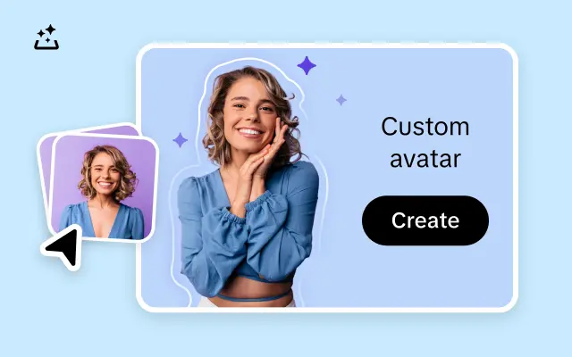
Custom Avatar
Create your own unique digital avatar for a personalized touch.
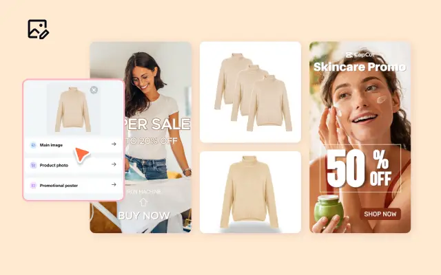
Image Editor
Your go-to tool for creating and editing images with ease.
Quick Cut
Speed up video editing by transcribing and editing directly from text.
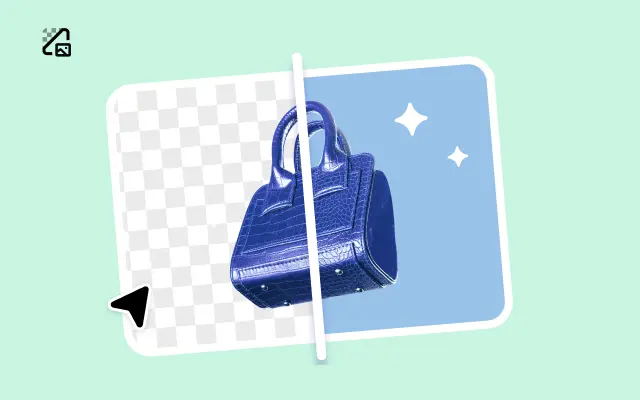
Remove Background
Instantly remove backgrounds from images with one click.
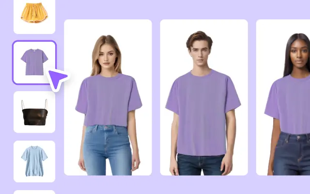
AI Model
Showcase your clothing on AI models for an immersive try-on experience.
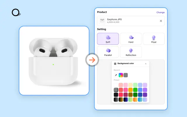
AI Shadows
Add lifelike shadows and lighting to products for enhanced realism.
About 3 Image Small Screen Template
Your digital content deserves to shine, no matter the screen size. With Pippit's 3 Image Small Screen Template, creating visually stunning and mobile-optimized designs has never been easier. Perfectly tailored for smartphones and compact displays, this template ensures your images are displayed beautifully without sacrificing clarity or style. Whether you're showcasing products, telling a story, or creating engaging social media posts, this template was built to captivate.
Say goodbye to clunky designs that don’t adjust well to smaller screens. The 3 Image Small Screen Template from Pippit is crafted with mobile users in mind, ensuring your visuals look sharp and professional at any resolution. Its streamlined layout lets you feature three images side by side or in a scrollable sequence, making it ideal for businesses looking to highlight product collections, before-and-after comparisons, or engaging visual narratives. And the best part? It takes just a few clicks to customize.
Pippit equips you with user-friendly, drag-and-drop tools that make personalizing the 3 Image Small Screen Template a breeze. Adjust colors, swap in your own photos, tweak text placements, and more—all in record time. Even if you don’t have a design background, Pippit empowers you to bring your creative vision to life. Want to add interactive elements? With built-in tools, enhancing engagement and encouraging clicks is as simple as a tap.
Your time is valuable—Pippit understands that. By focusing on ease of use and professional results, the 3 Image Small Screen Template helps you deliver polished content faster than ever. Ready to transform your visuals? Start with Pippit and bring your designs to every screen with confidence. Try it today!


